The Color That Changed Everything
There’s a particular shade of lime green that has, against all conventional logic, become the most consequential color in contemporary visual culture. It’s not a color that should work. It’s aggressively bright, slightly acidic to the eye, the kind of hue that designers spent the last decade carefully avoiding in favor of muted neutrals and dusty pastels. And yet, starting in August 2024, this specific green—officially a Pantone-adjacent hex value of #8ACE00—began appearing everywhere. Gallery walls. Art fair booths. Museum promotional materials. By March 2025, Artsy analysis of Brat’s influence on visual art marketing documented this shade in over 340 gallery show promotional materials and art fair installations globally.
This isn’t happenstance. This is the Brat effect, and it says something genuinely interesting about how visual culture works in the twenty-first century. Charli XCX’s album didn’t just dominate the music charts. It changed the aesthetic language that galleries, institutions, and independent artists use to signal identity and intent. The color became a password into a particular sensibility—one that values directness, playfulness, and a deliberate rejection of polish.
When a Designer’s Restraint Becomes Revolutionary
Creative director Imogen Sparke’s decision to render the Brat album cover as essentially text-on-color was, in retrospect, an act of genuine subversion. For roughly a decade, album artwork had been caught in an arms race of visual complexity. Layers. Collage. Glitch aesthetics. Maximalism as the default language of contemporary expression. Sparke looked at that trajectory and chose to go backward—or perhaps forward through the back door. A single word. A single color. Typography that looked like it could have been designed in 2003 or 1993 or tomorrow.
The Whitney Museum understood the implications immediately. In spring 2025, the institution launched a panel discussion titled “Post-Internet Aesthetics and the Pop Art Machine” that used Sparke’s design approach as a primary case study. The curatorial logic was sound: this album cover represented a reversal in how contemporary visual artists think about information density and viewer attention. What Sparke achieved was a kind of stripped-down maximalism—maximum impact through minimum means. Spotify reported that the album cover became the most screenshot and shared cover on their entire platform in 2024, a metric that suggests people weren’t just listening to the music; they were collecting the image itself, embedding it into their digital identities.
The Gallery World’s Scramble
Here’s where the story gets genuinely interesting. The art world—which likes to position itself as the arbiter of cultural taste, the space where serious visual ideas get vetted and consecrated—found itself responding to an aesthetic that originated in pop music. Major museums began incorporating that lime green into their spring programming announcements. Independent galleries adopted it for booth designs at art fairs. This wasn’t cynical copying. This was institutional recognition that visual authority had shifted. A musician and her designer had articulated something about contemporary desire that resonated more powerfully than anything the gallery circuit was currently offering.
When the Recording Academy announced that Charli XCX’s Brat had won the 2025 Grammy for Album of the Year, their official citation mentioned something that rarely appears in Grammy documentation: cultural visual impact. Alongside sonic achievements, the Academy specifically acknowledged the album’s visual design as central to its cultural significance. This was institutional validation of something that had already happened organically. Brat wasn’t just music with a cool cover. It was a total aesthetic statement that colonized visual space across disciplines.
Fashion, Economics, and What It Means When Pop Culture Sets the Tone
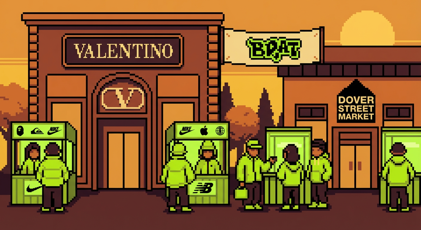
The economic implications crystallized almost immediately. Business of Fashion on the Brat economy documented how luxury house Valentino, Dover Street Market, and at least six independent streetwear labels launched lime-green capsule collections in Q4 2024 directly crediting the Brat aesthetic. The combined estimated revenue from these collections exceeded $40 million. This wasn’t a fleeting trend cycle. This was major commercial infrastructure reorganizing itself around a visual statement.
What matters here is that this wasn’t Charli XCX commissioning some grand aesthetic statement. This was an artist making intuitive choices about what felt true—what felt urgent—in this particular moment. Sparke’s design landed because it somehow articulated something people didn’t know they were feeling. A desire for clarity. For color. For visual statements that don’t apologize for taking up space. The gallery world responded not because they were trend-chasing, though some certainly were. They responded because they recognized a genuine cultural shift when they saw one.
What Comes Next
By the end of 2024 and into 2025, the initial shock had faded somewhat. The lime green remained omnipresent but had begun its inevitable transition from revolutionary to merely contemporary. This is what always happens with influential aesthetics. They saturate. They normalize. They become the visual language of a specific moment rather than a portal to the future. Something has shifted permanently, though, in how institutions think about visual authority. The art world is no longer simply dictating taste downward to mass culture. The relationship has become genuinely bidirectional.
What lingers is the recognition that a single aesthetic decision—a choice about color, about simplicity, about refusing the visual grammar that had dominated the previous decade—could reorganize an entire cultural landscape. Sparke and Charli XCX didn’t solve visual culture or establish some new permanent order. But they created a moment where institutions had to reckon with the possibility that innovation might come from outside traditional gatekeeping structures. They asked, essentially, what if the future of visual culture wasn’t about accumulation but about radical clarity? The gallery world is still figuring out how to answer that question. What’s your take on where this aesthetic is headed?