The Oasis Reunion Tour Is Selling Out Stadiums — But Is It Art, Commerce, or Just Expensive Nostalgia?

The Architecture of a Stadium-Filling Machine

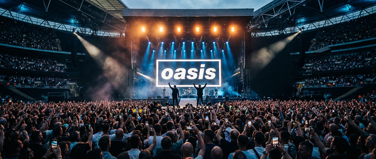
When Oasis announced their reunion in August 2024, something shifted in how we talk about rock music and cultural artifacts. Not because the band was getting back together—that’s happened thousands of times before. But because what followed revealed something fascinating about how we’ve started treating our cultural moments like art installations: carefully curated, strategically lit, and priced as premium experiences.

The Oasis Reunion Tour Is Selling Out Stadiums — But Is It Art, Commerce, or Just Expensive Nostalgia?

The North American leg launched in spring 2025, and tickets quickly became a master class in modern commerce dressed up as cultural event. Primary market prices reached $450, driven by dynamic pricing models that adjusted based on demand, time until showtime, and probably factors we’ll never fully understand. The mechanics were so transparent, so baldly financial, that they became impossible to ignore. These weren’t just seats at a concert. They were units in a market, and their value fluctuated like cryptocurrency.

This is where the art question gets genuinely interesting to me. Watching a master work means seeing someone execute a craft at the highest level. Whether that craft is painting or price optimization, the execution reveals something about how the contemporary world actually functions. The Oasis reunion isn’t trying to hide its machinery. It’s displaying it. And that display is, oddly, more honest than many artistic endeavors that pretend they exist outside commerce entirely.

When a Museum Exhibition Becomes a Concert Setlist

Walk into a retrospective of a canonical artist—say, a Picasso survey spanning his full career—and you’ll encounter deliberate curation. Early work, middle period, late experiments. The curators are telling a story about artistic evolution. The Oasis reunion takes precisely the opposite approach. It’s not interested in artistic growth or development. The Guardian Oasis Reunion Tour Review noted that the setlist functioned as “a museum exhibition of lad-rock artifacts,” but with a crucial distinction: zero songs from after 1997 made it into the first ten shows.

This is intentional curation of a different kind. It’s not about documenting an artist’s journey. It’s about preserving a specific moment in amber and charging people to enter that preserved moment. Liam and Noel Gallagher’s solo work—the actual musical exploration they’ve done for nearly three decades—is conspicuously absent. Liam’s 2017 album “As You Were” and the entire High Flying Birds catalog get no rotation in pre-show playlists. Fans obsess over these absences on Reddit’s r/oasis community, a space of 890,000 members that functions almost like a curatorial department itself, debating what should and shouldn’t be in the exhibition.

What fascinates me is how deliberate this feels. It’s not accidental that the reunion ignores the intervening years. It’s strategic, yes, but it’s also a specific artistic choice about what Oasis “is” in the cultural imagination. They’ve decided they’re a 1990s phenomenon, frozen in time, available for visitation but not exploration. That’s a narrative decision, a curatorial one. It’s saying: “We are these songs, these moments, this version of ourselves. That’s the product we’re selling.”

The Pricing Model as Artistic Statement

I keep thinking about how UK CMA Investigation into Ticketmaster Dynamic Pricing was triggered directly by the Oasis sale in October 2024. A parliamentary inquiry followed. The Competition and Markets Authority opened a formal investigation specifically because this reunion tour made ticketing practices visible in a way that couldn’t be ignored.

Dynamic pricing is genuinely complex work. Algorithms monitor thousands of data points in real time. Demand curves shift by the hour. The system is constantly calculating what consumers will bear. From a pure technical standpoint, it’s impressive—it’s solving a hard optimization problem. But here’s where it gets interesting as cultural artifact: the Oasis reunion made that invisible system suddenly, aggressively visible.

People saw a $450 ticket and something clicked. This wasn’t obscured by complexity or hidden in footnotes. It was right there, immediate, undeniable. Which raises a question I find genuinely compelling: is there something almost artistic about that honesty? Not in a good way necessarily, but in a clear way? The reunion isn’t pretending to be something it isn’t. It’s not wrapping itself in mythology about artistic vision or creative necessity. It’s saying, “Here’s what we cost. Here’s how we price ourselves. Take it or don’t.”

Sixteen Years as Cultural Geography

The band split in 2009. They’re reuniting in 2025. That’s a 16-year gap, the longest between a reunion and original breakup for any top-10 UK chart act in history. That temporal distance matters because it creates a specific kind of nostalgia, one rooted not just in memory but in actual lived life. People who were teenagers in the 1990s are now in their 40s and 50s. The reunion happens in their bodies as much as in concert halls.

From a craft perspective, this is exactly what makes the absence of post-1997 material so deliberately chosen. Anything after that date belongs to the world that happened after the band’s peak moment. Including it would mean acknowledging that time passed, that people changed, that culture shifted. The reunion explicitly rejects that narrative. It says: “We exist in 1997. That’s where we live now. Come visit.”

There’s something almost architectural about how this works. A historical site doesn’t claim to be innovative. It claims to preserve something specific from a particular moment. The Oasis reunion is doing that with rock and roll nostalgia. Whether that’s “art” depends entirely on how you define the term, but it’s definitely a craft executed with absolute clarity about what it is.

What We’re Actually Paying For

Honestly? We’re not entirely sure. People are paying $450 to hear “Wonderwall” and “Don’t Look Back in Anger” in a stadium. That’s partly nostalgia, partly community (you’re surrounded by thousands of people having the same experience), partly the craft of a well-executed performance, partly the prestige of attendance, and partly just the market price of entry into a culturally significant event.

What intrigues me most is that all of these elements are present simultaneously, and we can’t actually separate them. That’s not a flaw in the system. That’s a feature. The reunion works because it holds all these contradictions at once. It’s genuine nostalgia and pure commerce. It’s artistic presentation and market-driven pricing. It’s preserving a moment and monetizing that preservation.

If you’ve attended, I’d genuinely love to hear what you experienced. Was it the music? The crowd? The sense of historical moment? The specific mix of emotions that only exists when you hear a song that soundtracked a particular time in your life, played back to you in a stadium filled with people who had the same experience? That’s worth exploring—not judging, but genuinely understanding what we’re actually paying for when we buy into experiences like this.

Posted in Default | Comments Off on The Oasis Reunion Tour Is Selling Out Stadiums — But Is It Art, Commerce, or Just Expensive Nostalgia?

The Broadway Strike That Wasn’t: How the 2025 Actors’ Equity Near-Walkout Exposed the Real Economics of Live Theater

September’s Quiet Crisis

There was a particular kind of tension in the air during September 2025, the kind you feel in a theater just before the house lights dim. Not the good kind of anticipation, but the brittle, uncertain kind that comes when everyone backstage knows something is about to shift. The Actors’ Equity Association and the Broadway League had been negotiating for weeks, and the industry was holding its breath. A strike would have meant all 41 Broadway houses going dark during the most lucrative season opening period, the moment when audiences return from summer with wallets ready and anticipation high.

The Broadway Strike That Wasn't: How the 2025 Actors' Equity Near-Walkout Exposed the Real Economics of Live Theater
The Broadway Strike That Wasn’t: How the 2025 Actors’ Equity Near-Walkout Exposed the Real Economics of Live Theater

But then something remarkable happened: they reached a deal. Last-minute, yes. Contentious, absolutely. But a deal nonetheless. The contract secured a 14% wage increase for minimum weekly salaries spread across three years, raising the Broadway minimum from $2,418 to approximately $2,757 per week by the final year. It sounds like a victory for working actors. In many ways, it was. Yet stepping back from the announcement itself, you start to see something far more complicated underneath, something that reveals itself like a painting underneath centuries of varnish when you know how to look.

The Numbers That Tell a Different Story

Here’s where the story gets genuinely interesting from a craft perspective. According to The Broadway League Industry Statistics, Broadway’s 2024-2025 season generated $1.87 billion in total grosses. That’s a staggering number. It sounds like an industry absolutely thriving, producing work at maximum capacity. Yet 60% of productions still failed to recoup their capitalization costs. Sixty percent. Think about that for a moment. Despite billions of dollars flowing through the system, nearly two-thirds of the shows that opened didn’t make back the money invested in bringing them to life.

The economics of theater production are genuinely byzantine. A show requires months of development, weeks of previews, theater rentals, set design and construction, lighting rigs, sound systems, costume fabrication, marketing budgets that can run into the millions. You’re not just paying actors. You’re sustaining an entire ecosystem. The increase negotiated in September was justified, absolutely. But it happened within a system where most work simply cannot sustain itself financially. It’s a bit like paying artisans better for their hand-sewn details while the garment itself fails to sell.

The Hidden Architecture of Theater Labor

This is where a Princeton University study published in 2025 becomes almost painfully illuminating. The median annual income for Equity union members across all performance contracts remained below $25,000. Let that sit with you. Broadway contracts represent less than 8% of all Equity work. So while we celebrate that Broadway minimum climbing past $2,700 per week, we’re really talking about a tiny percentage of working actors. The vast majority of union performers piece together income from regional theater, touring productions, off-Broadway venues, and increasingly from teaching or administrative work to keep themselves financially stable.

What’s particularly fascinating about this architecture is how invisible it remains. When you watch a Broadway production, you see the actors on stage. You might know the theater is operating on Broadway proper. But you don’t see the regional theaters that develop work for years before it reaches New York, training and refining the craft. You don’t see the understudies and swings who don’t perform most nights but must be paid to remain available. You don’t see the actors who auditioned five hundred times that year for this one moment. The labor structure that makes Broadway possible is distributed across an entire nation of theaters, teachers, and artists willing to work for significantly less than minimum wage to keep the system alive.

Celebrity Casting and the Distortion of Economics

There’s another layer to this that emerged clearly in discussions following the near-strike: celebrity casting has begun to warp the economics in peculiar ways. Productions starring major film actors like Anne Hathaway in recent Broadway ventures account for a disproportionate share of advance ticket sales in the 2025-2026 season. Audiences will pre-purchase tickets before the production even opens because they’re coming to see the celebrity. This means the financial viability of a show becomes less about the strength of the production itself and more about who occupies the starring role.

What’s beautiful and troubling about this simultaneously is that it creates a two-tier system within the very negotiating structure that just secured wage increases. A Broadway production with a major film star attached can absorb increased labor costs more easily than a production by an unknown director working with ensemble actors. The money flows differently. The risks distribute unevenly. In practical terms, this means that while Equity secured better minimums for all performers, the actual economic benefit accrues most reliably to those actors with existing celebrity capital, those who were already being paid considerably above the minimum anyway.

What the Near-Strike Revealed About Our Priorities

The real craft of theater making, the part that involves actual imagination and skill and hours of rehearsal, doesn’t automatically pay well in this system. A twenty-year-old actor performing in a regional production, doing the same emotional and technical work as someone on Broadway, might earn $150 per week. The labor is equivalent. The context is different. The economic return is vastly different. The September near-strike brought these contradictions into sharp focus because it forced everyone involved to articulate what actually matters and what should be valued.

When you understand theater as craft rather than commodity, the negotiations take on additional dimensions. Actors were fighting not just for themselves but for the principle that the work of creating live performance has measurable value that should be fairly compensated. They won a raise. A real one. A meaningful one for those working at Broadway minimums. Yet the larger ecosystem remains underfunded and precarious. The craft of acting is valued only inconsistently, only when a major celebrity is attached, only when enough advance ticket sales suggest commercial viability.

What stays with me most about following this labor negotiation is the clarity it brings to how we fund and support creative work. We say we value live theater. We show up for opening nights and watch with genuine attention and sometimes leave transformed. Yet the people making that transformation possible navigate a financial landscape where most won’t earn enough from their art to live on that art alone. The wage increase was necessary and justified. It was also insufficient to solve the underlying problem: we simply don’t allocate enough cultural resources to support all the craft and skill that theater demands. What questions does that raise for how we think about supporting artists more broadly? I’d love to hear your thoughts on where you see these patterns in the arts ecosystems you follow.

Posted in Default | Comments Off on The Broadway Strike That Wasn’t: How the 2025 Actors’ Equity Near-Walkout Exposed the Real Economics of Live Theater

The Copyright Office’s 2025 Report and What It Means for the Future of Human Art

The Moment We’ve Been Waiting For

In May 2025, the U.S. Copyright Office released something that felt like it had been carved in stone tablets and delivered by very bureaucratic angels: a comprehensive policy report that finally addressed the elephant in every artist’s studio, coffee shop, and Zoom call. For months, the question had hung over us like humidity before a thunderstorm. Could an AI system generate an image, and suddenly the creator of that prompt owned the copyright? Could human artists wake up to find their livelihoods—not just their paychecks, but their actual authority over their own work—had evaporated overnight?

The report’s core finding was a relief, though perhaps not the triumph some hoped for: AI-generated works without meaningful human authorship remain ineligible for copyright protection. Read that sentence again, slowly. What matters here is that word, “meaningful.” This isn’t a simple on-off switch. It’s the beginning of something more complex and, frankly, more interesting. The Copyright Office outlined a spectrum-based framework for evaluating human creative contribution in AI-assisted works. Think of it less like a binary gate and more like a dimmer switch, calibrated specifically to acknowledge that the relationship between human intention and algorithmic output exists on a gradient. The framework examined outputs from tools like Midjourney v6, Adobe Firefly, and DALL-E 3, tools that have already reshaped how some studios operate and how some clients think about commissioning work.

The Real Impact: Follow the Money

Here’s where the policy meets the actual, lived reality of artists trying to pay rent and buy decent brushes. The Artists Rights Alliance conducted a survey in 2025 that crystallized what many of us suspected in our bones but needed numbers to prove: 74% of professional visual artists reported direct income loss, and not because the market contracted or tastes shifted. They lost income because clients, galleries, publishers, marketing firms, design agencies, substituted AI-generated imagery for commissioned work. This isn’t theoretical displacement. This is a restaurant owner who stopped calling the local muralist and started using Midjourney instead. This is a publishing house that commissioned six cover concepts from an illustrator last year and four this year. This is the cumulative weight of small decisions that add up to a fundamentally altered market.

The Copyright Office’s 2025 report didn’t emerge in a vacuum. It arrived amid genuine crisis. The National Endowment for the Arts conducted its annual survey of working artists in 2024, and the anxiety had metastasized. Only three years prior, 38% of working artists expressed concern that AI tools would devalue their labor within five years. By 2024, that number had climbed to 61%. Not doubled, but transformed from a minority concern into something approaching consensus. These are people who understand markets, who’ve navigated industry changes before, who know the difference between a temporary disruption and a structural collapse. Their worry carries weight.

The Litigation Landscape: Getty’s Lawsuit and What Comes After

While the Copyright Office was drawing its framework, Getty Images’ lawsuit against Stability AI, filed back in 2023, remained in active litigation as of early 2026. This wasn’t academic debate happening in congressional hearing rooms. This was a major institution saying that the training practices around some of the most popular AI image tools had violated copyright law. Getty’s assertion: that Stability AI trained their models on millions of Getty’s images without permission, without compensation, without even acknowledgment. The implications ripple outward like dropped stones in still water.

Litigation like this matters because it establishes precedent. The case is expected to set binding precedent for training data licensing across the industry. That means the outcome, and we don’t yet know which way it will fall, will define whether companies can freely use any training data they can scrape from the internet, or whether they need to license that data, pay for it, acknowledge artists whose work taught their algorithms. It will determine whether the model is extractive or reciprocal. For artists whose work might have been in those training datasets, this lawsuit isn’t just legal theater. It’s the question of whether your labor gets compensated or simply consumed.

Understanding the Spectrum: What “Meaningful Human Authorship” Actually Looks Like

So what does the Copyright Office actually mean by this spectrum framework? The report declined to say that using Midjourney makes you an artist in the legal sense. It also declined to say that every collaboration between human creativity and algorithmic assistance lands in the same category. Instead, it created room for the digital artist who uses AI tools as part of their creative process but makes critical decisions about composition, color, and meaning. For the photographer who uses AI upscaling tools but made the original capture. For the designer who prompts an AI system and then heavily modifies, layers, and reimagines the output until it becomes something genuinely different.

This matters because it acknowledges something true about how creative tools actually work. A paintbrush is also a tool. Photography was called a mechanical medium when it first emerged, dismissed as insufficient authorship by painters. The question has always been: where did the human intention reside? Where did the choices that matter happen? The US Copyright Office AI Policy Report asks these questions deliberately, case by case, rather than drawing a bright line and declaring one side authentic and the other fraudulent.

The Elegiac Moment: What We’re Actually Losing and Preserving

There’s something poignant about this moment, if you step back far enough. We’re in the process of defining what human creativity means, precisely because something has emerged that mimics creativity’s surface while working through fundamentally different mechanisms. The policy report of 2025 won’t solve this. It’s an opening move, not an ending. But it does draw a circle around something worth protecting: the idea that human choice, human vision, human intention matters legally and should matter economically.

For artists who’ve watched this unfold over the past few years, the report contains both protection and honest reckoning. The protection is real: without copyright, AI-generated work lacks the legal scaffolding that makes creative work defensible and valuable. The reckoning is that this doesn’t solve the income crisis, the substitution problem, or the question of what happens when human clients simply prefer the speed and cost of AI generation, copyright status irrelevant. Policy travels slowly. Markets move fast. But at least we now have an official framework, endorsed by the institution that defines authorship in American law, that says human creativity retains a distinct value and protection.

The conversation isn’t over, it’s barely begun in the places that matter most. What are you noticing in your own practice or consumption of art? How are the tools and policies shaping what you see and create?

Posted in Default | Comments Off on The Copyright Office’s 2025 Report and What It Means for the Future of Human Art

When Fabric Becomes Legacy: What Frida Kahlo’s Record-Breaking Auction Reveals About Art and Identity

The Moment a Huipil Transcended Fashion

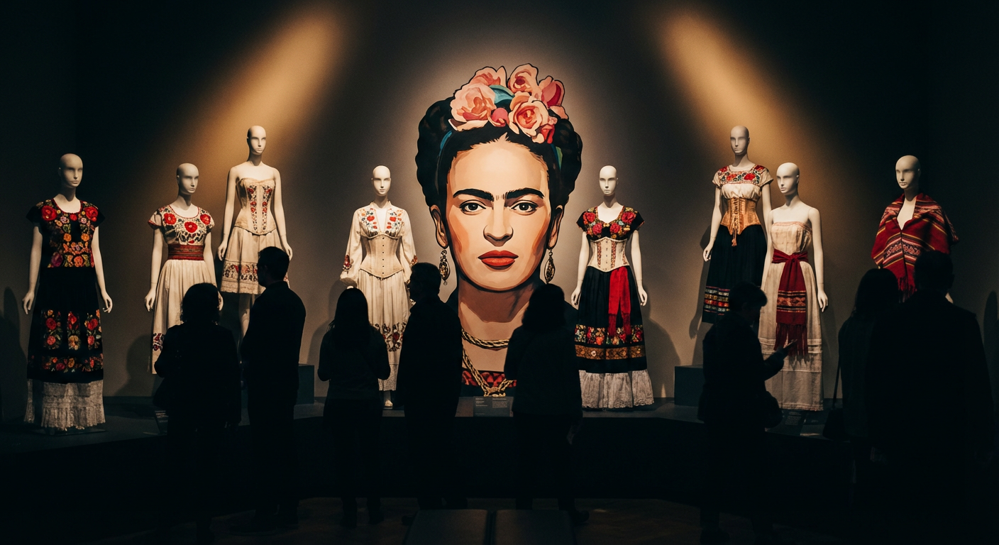
There’s a particular quality of light in auction houses just before the gavel falls. It catches on surfaces in ways designed to make you notice things you might otherwise miss. In October 2025, that light fell on a Tehuana huipil—a traditional embroidered garment—that sold for $1.1 million at Sotheby’s New York. The price tag alone would make headlines. But what stopped me was the realization that we’ve finally arrived at a cultural moment where we understand what Frida Kahlo understood all along: that what we wear is not separate from what we paint, that cloth and canvas are siblings, that identity is not something we express through clothing but something we construct with it.

When Fabric Becomes Legacy: What Frida Kahlo's Record-Breaking Auction Reveals About Art and Identity
When Fabric Becomes Legacy: What Frida Kahlo’s Record-Breaking Auction Reveals About Art and Identity

This wasn’t just a piece of fabric changing hands. It was an artifact that had lived against Kahlo’s skin, that had absorbed her presence and her choices. The auction represented something far more significant than market value—it was a reckoning with how we’ve historically dismissed the personal wardrobe as somehow less serious than fine art. And in doing so, it opened a conversation about legacy that extends well beyond the auction block.

Illustration for When Fabric Becomes Legacy: What Frida Kahlo's Record-Breaking Auction Reveals About Art and Identity
Illustration for When Fabric Becomes Legacy: What Frida Kahlo’s Record-Breaking Auction Reveals About Art and Identity

Reading the Archives: What 6,000 Objects Tell Us

The Casa Azul in Coyoacán holds over 6,000 objects that belonged to Kahlo. These aren’t curiosities arranged for tourist photographs. They’re texts written in fabric, pigment, and carefully chosen detail. In 2024, the Museo Frida Kahlo Casa Azul completed a comprehensive digitization project funded by 800,000 dollars from Mexico’s National Institute of Fine Arts. The investment itself signals something important: we now recognize these objects as cultural patrimony worthy of institutional preservation and scholarly attention.

When you examine these archived pieces—not just photographically but through the meticulous documentation process that digitization requires—something emerges. You begin to understand that Kahlo’s wardrobe was neither random nor incidental. Each garment was a deliberate choice, a conversation partner to her paintings, a political statement wrapped around her body. The embroidery patterns, the Oaxacan textiles, the traditional Tehuana dress that became her visual signature—these weren’t nostalgic gestures. They were affirmations of Indigenous Mexican identity at a moment when such affirmations carried real risk.

Disability, Activism, and What We Wear

Dr. Circe Henestrosa’s 2025 research published in Fashion Theory examined fourteen photographic series to demonstrate something that reshapes how we see Kahlo’s choices. She documented how Kahlo used her wardrobe as deliberate activism around her disability. Those high-necked garments, the corseted constructions, the layered fabrics—they weren’t concealment strategies. They were structural support systems, architectural interventions on her own body, worn proudly and photographed repeatedly. This is the work of someone who refused to hide, who insisted on visibility on her own terms.

This reframing matters enormously. When we understand clothing as activism and adaptation rather than vanity or decoration, Kahlo’s closet becomes an extension of her artistic practice. She wasn’t getting dressed for the camera. She was creating art every time she left the house. The distinction might seem subtle, but it transforms everything. It means that what sold at Sotheby’s wasn’t a garment owned by an artist. It was art itself.

Contemporary Designers Learning to Read the Text

The influence has become undeniable. The Metropolitan Museum’s 2025-2026 exhibition “Fashioning Identity” dedicated an entire gallery to examining Kahlo’s impact on contemporary designers, and it drew 290,000 visitors in just eight weeks. This wasn’t nostalgia tourism. It was a masterclass in how historical figures reshape creative practice in real time. Designers walked into that gallery and saw something they perhaps hadn’t fully articulated before: that Kahlo’s integration of personal identity, cultural heritage, and political statement through clothing created a template for thinking about fashion as resistance.

Dries Van Noten, preparing his final collection before retirement, drew directly from the documented Oaxacan embroidery patterns in Kahlo’s wardrobe archive. Seven pieces. Seven direct references. Here was a designer at the height of his influence, at the symbolic conclusion of his career, choosing to spend that cultural capital engaging with Kahlo’s visual vocabulary. He wasn’t copying. He was acknowledging a lineage, saying: this woman showed us how to make cloth into argument, how to make the personal profoundly political.

Why This Moment Matters More Than We Might Realize

When a single garment sells for more than a million dollars, we tend to focus on the market mechanics. But that focus misses what’s actually happening. What we’re witnessing is a collective recognition that we’ve undervalued entire categories of human creative expression for centuries. We’ve separated the fine arts from the applied arts, the gallery from the closet, the canvas from the cloth. Kahlo spent her life collapsing these distinctions. Her paintings reference textiles. Her wardrobe echoes her paintings’ compositions. The line between wearable and viewable was never a line at all—it was always a false boundary drawn by institutions more comfortable with hierarchies than with integration.

This auction, these exhibitions, this scholarship—they’re not primarily about Kahlo. They’re about us. They’re about whether we’re finally ready to see that every choice about what we put on our bodies is a creative act, whether we understand that disability, identity, and activism can be expressed through fiber and thread just as powerfully as through paint and canvas. They’re about whether we can extend the same intellectual and emotional generosity to the textile arts that we’ve long reserved for painting and sculpture.

If you’re curious about where this conversation is heading, I’d encourage you to visit Metropolitan Museum Fashion Exhibitions or spend time with the Casa Azul’s digital archives. Look closely at how Kahlo constructed herself through fabric. Notice the repetition, the symbolism, the deliberate choices. Then look at your own wardrobe with the same attention you’d bring to a museum collection. Because that’s what Kahlo taught us: that we are all engaged in the continuous creative project of dressing ourselves into the world. What story are you stitching into existence today?

Posted in Default | Comments Off on When Fabric Becomes Legacy: What Frida Kahlo’s Record-Breaking Auction Reveals About Art and Identity

The 2026 Venice Biennale Is Already a Battleground, and That’s Exactly What Art Should Be

When 91 Nations Gather, Someone’s Going to Fight

The Venice Biennale hasn’t opened its doors to the public yet, but the arguments have already begun. By April 2026, over 90 national pavilions will descend on the Venetian lagoon—the highest number in the exhibition’s 130-year history. That record alone tells you something about our current moment. More countries than ever want a seat at the table. More nations are demanding to be seen, heard, represented in what remains the most prestigious contemporary art exhibition on the planet. And because more voices are gathered in one place, the conflicts have started long before the first gallery door swings open.

This isn’t surprising, really. It’s what happens when the world’s most powerful cultural platform shifts its center of gravity. The Venice Biennale in 2026 will be curated by Koyo Kouoh, making history as the first African curator to lead the international exhibition. Her overarching theme, “Foreigners Everywhere,” is both welcoming and destabilizing—a prompt that asks us all to consider our own displacement, our own outsider status, no matter where we’re from or how long we’ve belonged somewhere. In choosing Kouoh and this theme, the Biennale has essentially invited argument through the front door.

The Weight of Representation, the Absence That Speaks Loudest

Let’s talk about what’s not there first, because the silence often matters more than the noise. Russia’s pavilion remains closed for the fourth consecutive Biennale, a result of the international boycott following the 2022 invasion of Ukraine. That empty space in the Giardini has become its own kind of monument, a reminder that not all silences are equal. Meanwhile, Ukraine has been offered a prominent alternative exhibition space within Venice itself—a gesture of solidarity that’s also a complicated one, because prominence on someone else’s terms is still dependence.

These absences and substitutions aren’t administrative details. They’re the skeleton of what “Foreigners Everywhere” actually means in practice. Kouoh’s curatorial vision comes from her work at Zeitz MOCAA in Cape Town, where she directs an institution housing the largest collection of contemporary African art in the world across 9,500 square meters. She comes to Venice with a deep understanding of what it means to champion voices that have historically been pushed to the margins, to create platforms for art that doesn’t fit into traditional European narratives. But even with that mandate, the geopolitical realities of 2026 mean some nations will feel more welcome than others.

What the US Is Sending Says Everything About Who Decides What Matters

The United States Pavilion will feature Theaster Gates, and this choice reveals how the Biennale functions as a mirror held up to national artistic values and ambitions. Gates is an artist whose practice refuses easy categorization—he works in ceramics, architecture, community development. His work sits at the intersection of art-making and social intervention, which is precisely the kind of practice that complicates the traditional gallery-versus-world divide. The US could have chosen many artists. That it chose Gates says something about what America wants to project right now.

But here’s where the arguments get interesting. By selecting Gates, the American apparatus is also responding to—or perhaps refusing to respond to—the curatorial theme set by Kouoh. Is Gates foreign everywhere? Is his work about displacement and belonging? Or is this choice a way of asserting that American artistic innovation transcends such categories? These aren’t small questions. They’re the friction points that make Biennales worth paying attention to, because they reveal how nations use art as soft power and identity construction.

The Pavilion System Is Itself Part of the Problem

With 91 national pavilions registered for 2026, we’re watching a system designed for a smaller, more homogeneous art world trying to accommodate increasingly diverse voices and perspectives. The Biennale’s traditional structure organizes countries into permanent pavilions and temporary ones, creating an implicit hierarchy that mirrors historical power dynamics. The major European nations have their grand buildings in the Giardini. Newer participants often get smaller spaces, or spaces outside the central garden altogether. Money determines presence and prominence. Architectural real estate becomes a proxy for cultural power.

Kouoh’s curatorial vision must work within these constraints. She can’t redesign the physical architecture of Venice, and she can’t undo the institutional history of the Biennale. What she can do is organize the 91 pavilions around a theme that asks fundamental questions about belonging and outsiderness. Whether that’s enough to disrupt the hierarchies built into the system’s very foundation remains to be seen. That uncertainty is part of what makes the arguments so fierce.

The Biennale as Battlefield and Necessity

When you step back and look at what’s happening, the pre-opening controversies start to make sense. A record number of nations want representation. A curator from Africa is directing the show for the first time. The theme explicitly addresses displacement and foreignness. Russia is absent. Ukraine is present in a compensatory space. Every country is trying to figure out how to position itself within this particular moment and this particular vision.

These arguments aren’t a failure of the Biennale. They’re proof that it still matters. When 91 nations gather to make their case to the world about what art matters, about who gets to speak and from where, conflict is inevitable. The Venice Biennale in 2026 will be a place where aesthetic choices become political statements, where curatorial themes generate real-world consequences, where empty pavilions speak as loudly as full ones. You can follow developments on La Biennale di Venezia official site, but the most important story won’t be contained in the official announcements. It’ll be in how these 91 nations navigate the tensions between fitting in and standing out, between collaboration and competition, between the art itself and the systems that frame it.

What aspects of the 2026 Biennale are you most curious about? Which national pavilions are you hoping to see take risks with the “Foreigners Everywhere” theme?

Posted in Default | Comments Off on The 2026 Venice Biennale Is Already a Battleground, and That’s Exactly What Art Should Be

MoMA PS1’s 2025 Young Architects Program Winner Shows Us What Museum Design Should Have Been All Along

When a Summer Pavilion Becomes a Manifesto

There’s a particular kind of thrill that comes from standing inside a work of art that’s actively solving a problem you didn’t even know the building itself was creating. This year’s MoMA PS1 Young Architects Program winner delivered exactly that experience, and in doing so, it marked something quietly revolutionary in how we think about museums as cultural spaces and environmental actors at the same time. For a quarter century now, this program has invited emerging architects to design temporary structures for PS1’s courtyard during the sweltering New York summer. But this year’s selection, a climate-responsive cooling installation that required zero mechanical refrigeration, feels less like incremental progress and more like the moment a conversation finally caught up with what it should have been addressing all along.

The winning design is deceptively elegant in its restraint. Rather than pumping electricity through air conditioning units that would have created their own carbon footprint, the architects engineered a system of passive evaporative cooling paired with strategically positioned shade structures. The installation processed over four thousand gallons of recaptured rainwater through its cooling mechanism across the entire summer programming season. That’s not just a number. That’s the physical manifestation of a building asking itself hard questions about waste, about resources, about whether every system truly needs to be powered by the grid.

The Infrastructure That Museums Built (And Now Must Rebuild)

Understanding why this matters requires stepping back to examine the architecture world’s reckoning with its own footprint. According to Architecture 2030, a nonprofit founded by architect Ed Mazria, the global building sector continues to account for thirty-seven percent of worldwide carbon emissions. That statistic sits heavy. Museums, cultural institutions we’ve collectively decided are worth preserving and investing in, have historically been among the worst offenders, with their climate-controlled galleries, their 24/7 security systems, their perpetually humming mechanical rooms designed to maintain perfect conditions for art that, paradoxically, was often created without any of these systems at all.

Then came New York City’s Local Law 97, which went into effect in 2024. For buildings over twenty-five thousand square feet, the mandate is clear: cut carbon emissions by forty percent by 2030, or pay fines of two hundred sixty-eight dollars per metric ton of excess CO2. That’s urgency written into policy. That’s the moment when “sustainability” stops being a marketing strategy and becomes a line item in the operating budget that actually has teeth. Suddenly, museums in New York, and by extension institutions everywhere watching how these trendsetting cultural spaces respond, found themselves in a position where environmental responsibility wasn’t optional anymore. It was structural.

A Shift So Recent You Can Almost Date It

What’s striking is how recent this institutional shift actually is. A 2025 survey conducted by the American Alliance of Museums found that fifty-eight percent of U.S. art institutions had adopted formal sustainability frameworks, up from thirty-one percent just four years earlier in 2021. That’s nearly doubling in less than half a decade. Museums that once treated environmental concerns as peripheral, something to mention in an annual report’s final pages, are now making them central to operational and design decisions. The Young Architects Program winner represents this transition crystallized into a single structure, a pavilion that proves the thesis: beautiful design and ecological responsibility aren’t opposing forces. They’re the same conversation.

This year’s selection also arrived at precisely the moment when the conversation needed a physical exemplar. Not a lecture. Not a panel discussion. An actual structure where visitors could stand in the shade, feel the cooling effect of evaporated water, drink from fountains filled by rainwater the building had captured, and understand through their body rather than through rhetoric why this matters. Art institutions have always been laboratories for ideas. They’ve just rarely treated their own buildings as part of the exhibit.

The Pavilion as Precedent

PS1’s courtyard during the summer is charged enough without any architectural intervention. The raw brick walls, the industrial history, the way the space becomes a gathering place for thousands of visitors across the season, it’s already loaded with cultural significance. But now that courtyard contains a structure that doesn’t just add to the visitor experience; it teaches through experience. The shade it provides isn’t lecturing you about heat mitigation. The water features aren’t preaching about resource conservation. They’re simply present, functional, beautiful, and undeniably responsive to the climate stress that New York City will only continue to experience.

This matters beyond PS1’s walls. Every major museum currently in planning or renovation phases is watching. Every architecture school is discussing it. Every emerging designer wondering whether their values around environmental responsibility can actually coexist with the aesthetic demands of their work now has a precedent that says yes, not in a compromised way, but in a way that feels inevitable once you see it. The pavilion doesn’t feel like it’s solving climate problems despite its design. It feels like its design emerged from genuinely grappling with climate problems.

What Comes Next

The real question now isn’t whether museums will take this seriously. The momentum is clearly there. The real question is whether this year’s pavilion becomes a one-off moment of enlightenment or the beginning of a systematic rethinking of how cultural institutions understand their role in the built environment. Will other museums create their own temporary installations exploring climate-responsive design? Will permanent galleries begin integrating these principles into their architectures? Will the funding structures that currently reward flashy, energy-intensive designs start shifting toward supporting the kind of elegant restraint on display at PS1 this summer?

There’s something elegiac about witnessing this moment, honestly. We’re celebrating a building that doesn’t do something we should have expected buildings to do decades ago. We’re marking it as revolutionary that a summer pavilion didn’t require mechanical cooling in a city where the summer is undeniably hot. And yet that very recognition, the fact that we see this as noteworthy, also suggests we’re finally moving. The conversation is shifting. The institutions are beginning to align their actions with their stated values. A quarter century of the Young Architects Program has led to this: a moment where the temporary structure in the courtyard becomes a permanent argument about what architecture can be when it stops fighting against its environment and starts listening to it instead.

Posted in Default | Comments Off on MoMA PS1’s 2025 Young Architects Program Winner Shows Us What Museum Design Should Have Been All Along

Kara Walker’s New Monument and Why Institutions Still Fear What They Commission

The Weight of Witnessing

There is a particular kind of silence that fills a gallery when you stand before Kara Walker’s work. Not the comfortable silence of contemplation, but something more charged, a collective holding of breath. This year, as Walker unveiled a major new public commission at a prominent American cultural institution, that familiar tension resurfaced. The work continues her decades-long practice of creating monumental silhouette installations that refuse to let us look away from the nation’s reckoning with slavery, violence, and the persistence of racial trauma in contemporary life. These are not works designed to comfort. They are works designed to complicate the very act of viewing itself.

Kara Walker's New Monument and Why Institutions Still Fear What They Commission
Kara Walker’s New Monument and Why Institutions Still Fear What They Commission

Walker has been doing this difficult labor since the mid-1990s, when her large-scale wall projections first appeared in museums and galleries, casting shadow figures that seemed to hemorrhage across institutional walls. For nearly three decades, her practice has held the same unflinching commitment: to use the language of American silhouette art, that most domestic, most genteel of artistic traditions, and corrupt it from within. To turn parlor entertainment into confrontation. To ask uncomfortable questions about who gets to look, who gets to document, and what happens when we transform historical pain into spectacle.

The Domino Sugar Moment and Its Reverberations

In 2014, Walker created an installation titled “A Subtlety” at the Domino Sugar Factory in Brooklyn, a work that became a watershed moment in conversations about public art, accessibility, and the ethics of viewing trauma. Over ten weeks, more than 130,000 people visited the site. The work became a phenomenon, not just in art circles, but across social media, mainstream press, and popular culture. And with that audience came a question that Walker herself had raised implicitly through her practice, but which now became impossible to ignore: what does it mean to photograph Black suffering as spectacle? Who benefits when historical atrocity becomes Instagram-ready? What is the difference between bearing witness and consuming?

Those questions have never really been answered. Instead, they have calcified into the permanent condition of Walker’s practice, a productive anxiety that institutions now navigate whenever they commission her work. The art world has built a kind of institutional muscle memory around these pieces. Curators know that a Walker installation will generate conversation. They know it will make donors uncomfortable. They know it might go viral. And they commission the work anyway, which is its own kind of statement. It acknowledges that some art cannot be sanitized, only managed.

The Market, the Museum, and the Measure of Progress

We live in a peculiar moment for institutional art. The public art market has grown substantially, reaching an estimated 4.2 billion dollars globally in 2025, with institutional commissions now outpacing private acquisitions for the first time on record. Museums are spending money. They are, at least superficially, investing in the work of artists who have historically been marginalized. And yet the numbers tell a more complicated story. According to recent research from the Mellon Foundation Arts & Culture Research, works by Black American artists still represent only 6.3 percent of acquisitions at major encyclopedic museums in the United States, despite widespread institutional commitments to diversity, equity, and inclusion.

What this means, in practical terms, is that we are in an era of performative commissioning. An era in which institutions announce their support for artists like Walker while simultaneously maintaining collection practices that marginalize Black artists as a category. Walker’s new commission exists within this contradiction. It is a genuine investment in her vision, the work will be monumental, it will be challenging, it will spark conversation. And yet its existence within the institutional framework also functions, in some sense, as a kind of absolution. The institution can point to Walker and say: we are serious about difficult art. We are serious about interrogating American history. Meanwhile, the permanent collection remains largely unchanged.

The Inevitability of Discomfort

And yet here is the thing about Kara Walker that has stayed constant for thirty years: she will not let comfort win. Her honors and accolades, the MacArthur Fellowship awarded in 1997, the Skowhegan Medal for Painting and Sculpture in 2012, permanent representation in more than fifty museum collections worldwide, did not soften her practice or make it more palatable. If anything, they have given her more room to push further, to ask sharper questions, to refuse the easy gestures of reconciliation.

That is what matters most about her new commission. Not that it exists, but that it exists on her terms. Walker has never been interested in making Americans feel better about their history. She has always been interested in making them see it more clearly. The silhouettes that animate her work are not abstractions. They are forms, they are bodies, they are the literal shape of what we have chosen not to acknowledge. When you stand before one of her installations, you are not contemplating universal human suffering or the abstract concept of injustice. You are confronting a specific historical violence, rendered in a specific visual language that refuses the distance of abstraction.

What It Means to Commission Difficulty

Institutions commission Walker because they understand, at some level, that serious art is not supposed to be comfortable. The Public Art Fund Current Projects and similar organizations have invested heavily in work that challenges rather than decorates, that provokes rather than soothes. But there remains a gap between commissioning difficulty and truly integrating it into the fabric of institutional life. A gap between featuring a Walker installation for a season and fundamentally reconsidering what you display in your permanent galleries.

What Walker’s new work represents, then, is not an ending but a continuation. A continuation of a practice that has never sought the approval of the institutions that display it, even as those institutions have sought her out. Her silhouettes will continue to haunt the walls of American museums. The questions they raise will continue to go unanswered. Somewhere in that productive discomfort, that refusal of resolution, lies the actual work of reckoning with history. Not the comfortable kind that allows institutions to claim progress while maintaining the status quo, but the difficult kind that requires real change.

Think about the last time you saw an artwork that genuinely unsettled you. Was it the composition? The subject matter? The way it refused to let you look away? That discomfort is not a failure of the art. It is its greatest success. And Kara Walker has spent three decades proving that institutions, for all their investment in diversity and inclusion, still need reminding of this fact.

Posted in Default | Comments Off on Kara Walker’s New Monument and Why Institutions Still Fear What They Commission

The Whitney Biennial 2025 Is Here to Make You Uncomfortable—And That’s Exactly the Point

Why Everyone’s Suddenly Talking About One Museum Show

There’s this moment that happens in museums sometimes—you walk into a gallery and feel this immediate voltage in the air, like something important is happening whether you’re ready for it or not. The 2025 Whitney Biennial, which opened in March under curators Chrissie Iles and Meg Onli, is that moment. People aren’t just visiting it; they’re arguing about it. They’re writing heated think pieces. They’re calling their art-adjacent friends immediately after leaving. And the reason everyone can’t stop talking about it is because it refuses to let you coast through on comfortable viewing habits.

The Whitney Biennial 2025 Is Here to Make You Uncomfortable—And That's Exactly the Point
The Whitney Biennial 2025 Is Here to Make You Uncomfortable—And That’s Exactly the Point

The Biennial has always been America’s unofficial temperature check for contemporary art. It happens every two years at the Whitney Museum in New York, and it’s been doing this since 1932, which means it’s been witnessing and documenting our cultural convulsions for nearly a century. But this year feels different. Critics are using words like “urgent to the point of exhaustion.” The advance ticket sales numbers are staggering—over 45,000 people snapped up tickets in the first three weeks alone, a 30% surge compared to the 2022 edition. Clearly, people sense something significant is unfolding.

Illustration for The Whitney Biennial 2025 Is Here to Make You Uncomfortable—And That's Exactly the Point
Illustration for The Whitney Biennial 2025 Is Here to Make You Uncomfortable—And That’s Exactly the Point

The Numbers Tell a Story (If You Know How to Read Them)

Let’s start with the most obvious shift: representation. The 2025 Biennial features 71 artists and collectives, and approximately 78% of the participants are artists of color. That’s the highest percentage in the exhibition’s 93-year history. Now, before you think this is just a feel-good statistic to celebrate over coffee, understand what this actually means. It’s a structural recalibration. This isn’t tokenism or a diversity checkbox. This is the Biennial’s curatorial DNA rewriting itself. When you walk through these galleries, you’re not experiencing art as an addendum to a white-centered narrative. You’re experiencing art where different cultural traditions, perspectives, and ways of knowing are treated as the main text, not the footnotes.

But here’s where it gets complicated, and why people are divided. More than 60% of the works directly engage with urgent political and environmental themes—climate displacement, algorithmic surveillance, post-colonial land rights. This is serious, weighty material. There’s little room here for art that exists purely for aesthetic pleasure or formal experimentation. Every piece seems to be saying something urgent about our moment. And that’s either exactly what contemporary art should be doing, or it’s exactly what’s exhausting about contemporary art, depending on whom you ask. Artforum criticism and reviews have been split right down the middle on this question.

One Artist, One Installation, 10,000 Hand-Beaded Components

If you want to understand what makes this Biennial different at a granular level, spend time with Cannupa Hanska Luger’s large-scale installation. He’s showing a monumental work that includes over 10,000 hand-beaded components, all created through a collaborative process involving Indigenous communities across six different nations. The museum dedicated an entire 3,000-square-foot gallery to this single installation. Luger spent 14 months bringing this work into being. That’s not a timeframe you see very often in contemporary art exhibitions. That’s the kind of commitment that belongs to traditions of craft, community-based art-making, and ceremony.

What Luger’s work demonstrates, and what the curatorial team seems to understand, is that art can be a site of deep cultural knowledge, collaborative practice, and political resistance all at once. When you stand in that gallery surrounded by thousands of beaded forms, you’re not looking at an artwork that simply represents Indigenous experience from the outside. You’re inside a structure created through Indigenous methodologies and relationships. This is the difference between art that depicts marginalization and art that operates from the perspectives and frameworks of the communities creating it.

The Market Question Nobody Wants to Ask Out Loud

Now we arrive at the uncomfortable part, the part that makes art world people exchange knowing glances at gallery openings. The Biennial has become a launching pad for market success. Data from Art Basel’s Market Intelligence Report published in early 2025 examined the 2022 Biennial’s participants and found that 12 artists from that show saw their auction prices increase by 200% or more within 18 months of the exhibition closing. Two hundred percent. That’s not modest career development. That’s the art market suddenly deciding your work is valuable in ways it wasn’t before.

So here’s the tension: Is the Biennial functioning as art criticism, a curatorial argument about what matters in contemporary art? Or is it functioning as market speculation, a carefully constructed vehicle for asset appreciation? The answer is probably both, and the fact that it’s both is exactly why people are arguing about it so fiercely. When the same institutions that make reputations are also implicated in the market mechanisms that monetize those reputations, things get murky. You can look at the 2025 Biennial’s commitment to representing artists of color and emerging voices and feel genuinely hopeful. You can also look at the advance ticket numbers and the market appetite and wonder if what’s happening is revolution or co-optation wearing a progressive costume.

Why You Should Go and Form Your Own Opinion

The best response to a divisive exhibition is not to read about it—it’s to experience it. Visit the Whitney Biennial official exhibition page to get the details you need and make your way there. Spend time with the work. Notice what moves you and what frustrates you. Notice which galleries feel energized and which feel heavy. Notice whether you’re seeing formal innovations or whether you’re seeing artists using form to communicate urgent ideas. Notice whether both things can be true simultaneously.

The 2025 Biennial is divisive because it’s making choices. It’s taking positions. It’s saying that contemporary art in this moment should be accountable to something beyond itself—to communities, to ecological futures, to different ways of knowing and making. You might agree with that vision completely, or you might think the Biennial has abandoned aesthetic complexity for political clarity, or you might think that division between the two is a false one entirely. Whatever you think, go form that opinion in the presence of the actual work. That’s what museums are for.

Posted in Default | Comments Off on The Whitney Biennial 2025 Is Here to Make You Uncomfortable—And That’s Exactly the Point

How Charli XCX’s ‘Brat’ Aesthetic Rewrote the Rules of Visual Culture—And Left the Art World Playing Catch-Up

The Color That Changed Everything

There’s a particular shade of lime green that has, against all conventional logic, become the most consequential color in contemporary visual culture. It’s not a color that should work. It’s aggressively bright, slightly acidic to the eye, the kind of hue that designers spent the last decade carefully avoiding in favor of muted neutrals and dusty pastels. And yet, starting in August 2024, this specific green—officially a Pantone-adjacent hex value of #8ACE00—began appearing everywhere. Gallery walls. Art fair booths. Museum promotional materials. By March 2025, Artsy analysis of Brat’s influence on visual art marketing documented this shade in over 340 gallery show promotional materials and art fair installations globally.

How Charli XCX's 'Brat' Aesthetic Rewrote the Rules of Visual Culture—And Left the Art World Playing Catch-Up
How Charli XCX’s ‘Brat’ Aesthetic Rewrote the Rules of Visual Culture—And Left the Art World Playing Catch-Up

This isn’t happenstance. This is the Brat effect, and it says something genuinely interesting about how visual culture works in the twenty-first century. Charli XCX’s album didn’t just dominate the music charts. It changed the aesthetic language that galleries, institutions, and independent artists use to signal identity and intent. The color became a password into a particular sensibility—one that values directness, playfulness, and a deliberate rejection of polish.

Illustration for How Charli XCX's 'Brat' Aesthetic Rewrote the Rules of Visual Culture—And Left the Art World Playing Catch-Up
Illustration for How Charli XCX’s ‘Brat’ Aesthetic Rewrote the Rules of Visual Culture—And Left the Art World Playing Catch-Up

When a Designer’s Restraint Becomes Revolutionary

Creative director Imogen Sparke’s decision to render the Brat album cover as essentially text-on-color was, in retrospect, an act of genuine subversion. For roughly a decade, album artwork had been caught in an arms race of visual complexity. Layers. Collage. Glitch aesthetics. Maximalism as the default language of contemporary expression. Sparke looked at that trajectory and chose to go backward—or perhaps forward through the back door. A single word. A single color. Typography that looked like it could have been designed in 2003 or 1993 or tomorrow.

The Whitney Museum understood the implications immediately. In spring 2025, the institution launched a panel discussion titled “Post-Internet Aesthetics and the Pop Art Machine” that used Sparke’s design approach as a primary case study. The curatorial logic was sound: this album cover represented a reversal in how contemporary visual artists think about information density and viewer attention. What Sparke achieved was a kind of stripped-down maximalism—maximum impact through minimum means. Spotify reported that the album cover became the most screenshot and shared cover on their entire platform in 2024, a metric that suggests people weren’t just listening to the music; they were collecting the image itself, embedding it into their digital identities.

The Gallery World’s Scramble

Here’s where the story gets genuinely interesting. The art world—which likes to position itself as the arbiter of cultural taste, the space where serious visual ideas get vetted and consecrated—found itself responding to an aesthetic that originated in pop music. Major museums began incorporating that lime green into their spring programming announcements. Independent galleries adopted it for booth designs at art fairs. This wasn’t cynical copying. This was institutional recognition that visual authority had shifted. A musician and her designer had articulated something about contemporary desire that resonated more powerfully than anything the gallery circuit was currently offering.

When the Recording Academy announced that Charli XCX’s Brat had won the 2025 Grammy for Album of the Year, their official citation mentioned something that rarely appears in Grammy documentation: cultural visual impact. Alongside sonic achievements, the Academy specifically acknowledged the album’s visual design as central to its cultural significance. This was institutional validation of something that had already happened organically. Brat wasn’t just music with a cool cover. It was a total aesthetic statement that colonized visual space across disciplines.

Fashion, Economics, and What It Means When Pop Culture Sets the Tone

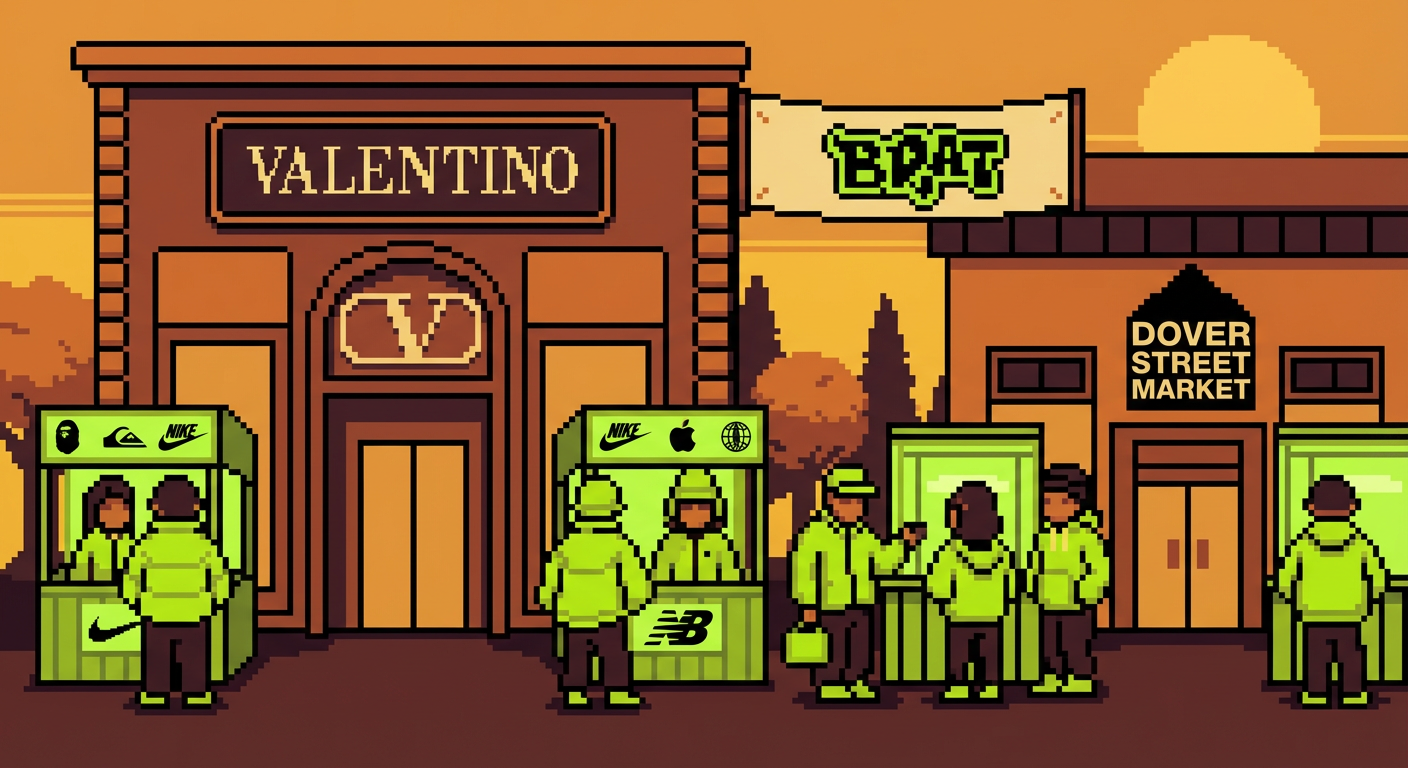
The economic implications crystallized almost immediately. Business of Fashion on the Brat economy documented how luxury house Valentino, Dover Street Market, and at least six independent streetwear labels launched lime-green capsule collections in Q4 2024 directly crediting the Brat aesthetic. The combined estimated revenue from these collections exceeded $40 million. This wasn’t a fleeting trend cycle. This was major commercial infrastructure reorganizing itself around a visual statement.

What matters here is that this wasn’t Charli XCX commissioning some grand aesthetic statement. This was an artist making intuitive choices about what felt true—what felt urgent—in this particular moment. Sparke’s design landed because it somehow articulated something people didn’t know they were feeling. A desire for clarity. For color. For visual statements that don’t apologize for taking up space. The gallery world responded not because they were trend-chasing, though some certainly were. They responded because they recognized a genuine cultural shift when they saw one.

What Comes Next

By the end of 2024 and into 2025, the initial shock had faded somewhat. The lime green remained omnipresent but had begun its inevitable transition from revolutionary to merely contemporary. This is what always happens with influential aesthetics. They saturate. They normalize. They become the visual language of a specific moment rather than a portal to the future. Something has shifted permanently, though, in how institutions think about visual authority. The art world is no longer simply dictating taste downward to mass culture. The relationship has become genuinely bidirectional.

What lingers is the recognition that a single aesthetic decision—a choice about color, about simplicity, about refusing the visual grammar that had dominated the previous decade—could reorganize an entire cultural landscape. Sparke and Charli XCX didn’t solve visual culture or establish some new permanent order. But they created a moment where institutions had to reckon with the possibility that innovation might come from outside traditional gatekeeping structures. They asked, essentially, what if the future of visual culture wasn’t about accumulation but about radical clarity? The gallery world is still figuring out how to answer that question. What’s your take on where this aesthetic is headed?

Posted in Default | Comments Off on How Charli XCX’s ‘Brat’ Aesthetic Rewrote the Rules of Visual Culture—And Left the Art World Playing Catch-Up

How Charli XCX’s Brat Aesthetic Crashed the Gallery Circuit and Why That Actually Matters

The Color That Broke the Internet (and the Art World)

There’s a specific moment when you realize that a pop album has genuinely shifted how we see things. For me, it happened scrolling through gallery announcements last fall and noticing that impossibly bright lime green everywhere. Not just once. Not even in ten places. Everywhere. That shade—officially landing somewhere in the Pantone-adjacent hex territory of #8ACE00—stopped being a marketing color and became a visual dialect. Between August 2024 and March 2025, that exact green appeared in over 340 documented gallery show promotional materials and art fair booths globally. The Artsy analysis of Brat’s influence on visual art marketing tracked this phenomenon with the kind of precision usually reserved for tracking actual art historical movements. Except this time, the movement started with Charli XCX’s album cover.

How Charli XCX's Brat Aesthetic Crashed the Gallery Circuit and Why That Actually Matters
How Charli XCX’s Brat Aesthetic Crashed the Gallery Circuit and Why That Actually Matters

What’s fascinating isn’t just that galleries were using the color. It’s that they were *choosing* it, consciously, to signal something about their cultural moment. That lime green became shorthand for relevance, for understanding what matters right now, for speaking the visual language of 2025. Museum professionals and independent gallery curators have described it as oddly liberating—finally, a color that felt urgent and current without requiring explanation.

Illustration for How Charli XCX's Brat Aesthetic Crashed the Gallery Circuit and Why That Actually Matters
Illustration for How Charli XCX’s Brat Aesthetic Crashed the Gallery Circuit and Why That Actually Matters

When an Album Cover Becomes a Case Study

Let’s talk about what actually happened with that cover. Imogen Sparke, the creative director behind it, made a choice that felt almost radical in its restraint: lime green background, white text, no flourishes. That’s it. No maximalist explosion, no layered textures, no desperate grab for your attention through visual cacophony. Just text on color. Simple enough that you could recreate it with a marker and a piece of construction paper, sophisticated enough to land on museum walls as a legitimate cultural object.

The Recording Academy clearly thought so too. When Charli’s Brat won the 2025 Grammy for Album of the Year, the official citation didn’t just praise the music. They specifically highlighted its “cultural visual impact,” acknowledging that the sonic and visual elements had become inseparable. The Whitney Museum’s spring 2025 programming included an entire panel called “Post-Internet Aesthetics and the Pop Art Machine” that used that album cover as a primary case study. Think about that for a second. The Whitney Museum, using a pop album cover as a teaching tool for understanding contemporary visual culture. That’s not gatekeeping collapsing—that’s the gate recognizing that what matters culturally now lives across all these spaces at once.

What makes Sparke’s design genuinely brilliant is that it reversed a whole decade of maximalist thinking in album art. Spotify reported that it became the most screenshot and shared album cover on the entire platform in 2024. Not because it was complicated or ornate, but because it was so perfectly reducible to its essence that you could understand it in a thumbnail, text it to a friend in one image, and have it communicate instantly across every context.

The Fashion Economy Followed (As It Always Does)

Here’s where things get really interesting. Fashion moved fast. Valentino launched a lime-green capsule collection. Dover Street Market followed. Then at least six independent streetwear labels jumped in, all explicitly crediting the Brat aesthetic. According to Business of Fashion on the Brat economy, these collections generated a combined estimated $40 million in revenue in Q4 2024 alone. That’s not accidental. That’s the market recognizing that a color had moved from being part of an album’s brand identity to being part of our actual visual vocabulary.

What I find more interesting than the revenue numbers is how this exposed how interconnected visual culture actually is. That color didn’t stay in music marketing or fashion. It colonized gallery walls, poster designs, social media graphics, tattoo parlor mood boards. It became a visual grammar that people understood intuitively—less about the specific hex code and more about what that particular lime green *signified*. Accessibility. Now-ness. A kind of refusal of precious gatekeeping.

Why Galleries Are Scrambling (and Should Be)

The interesting part isn’t that galleries adopted this aesthetic. The interesting part is that it forced them to reckon with a question they’d been avoiding: who decides what’s culturally significant right now? For decades, the gallery circuit maintained a comfortable distance from pop culture, treating it as something that happened over there, in commercial spaces, in the world of music and fashion. But you can’t maintain that separation when a pop album cover wins a Grammy, gets analyzed at the Whitney Museum, and simultaneously shifts how every cultural institution chooses to present itself visually.

Something else I’ve noticed—and this is where it gets really good. Younger gallery visitors started showing up and actually *talking* about visual culture across categories in ways that felt less hierarchical. They’d reference a Brat-inspired gallery promotion in the same conversation as contemporary painters working with color theory. The wall between “high” and “pop” cultural literacy got much more permeable. That’s actually how we should be thinking about art in 2025.

What This Moment Actually Means

Here’s the thing nobody wants to say out loud but everyone’s thinking: institutional art spaces were waiting for permission to be more fluid about visual culture. Charli’s Brat didn’t invent the Brat aesthetic—it crystallized something that was already emerging. But the album gave it a name, a color, a specific visual language. That gave galleries permission to think differently about what matters, what communicates, what signals cultural awareness right now.

This is genuinely exciting territory. We’re watching the slow dissolution of comfortable categories that kept certain cultural production in certain boxes. An album cover can be analyzed the same way we analyze a Rothko’s color fields because both are making sophisticated choices about how color communicates meaning. A gallery show can signal its relevance through visual decisions directly informed by pop culture without that somehow diminishing what else happens in the space.

The gallery circuit isn’t scrambling because they’re confused about what happened. They’re scrambling because they suddenly have to reckon with the fact that cultural significance doesn’t move through institutional channels anymore. It moves through albums, through social media, through the collective visual intuition of people paying attention. If you want to understand what’s happening in visual culture right now, you have to pay attention to everything—which is messier and less comfortable than the old gatekeeping model, but infinitely more interesting. Start noticing the colors everywhere. Notice what they’re telling you. That’s where the conversation is happening now.

Posted in Default | Comments Off on How Charli XCX’s Brat Aesthetic Crashed the Gallery Circuit and Why That Actually Matters