The Getty’s Vermeer Revolution: How Multispectral Imaging is Transforming Our Understanding of Light Itself

Three Hidden Worlds Beneath the Surface

Picture yourself standing in front of Vermeer’s “Girl with a Pearl Earring.” You’ve seen it a thousand times—the luminous turban, that impossible pearl catching light like a captured star, the girl’s lips slightly parted as though she’s about to speak across centuries. Now imagine learning that beneath what you’re seeing, there are at least three completely distinct layers of paint and preparation that nobody could properly detect until 2024. This is what the Getty Conservation Institute’s multispectral imaging analysis revealed, and it genuinely changes how we understand what Vermeer was doing at his easel.

The Getty's Vermeer Revolution: How Multispectral Imaging is Transforming Our Understanding of Light Itself
The Getty’s Vermeer Revolution: How Multispectral Imaging is Transforming Our Understanding of Light Itself

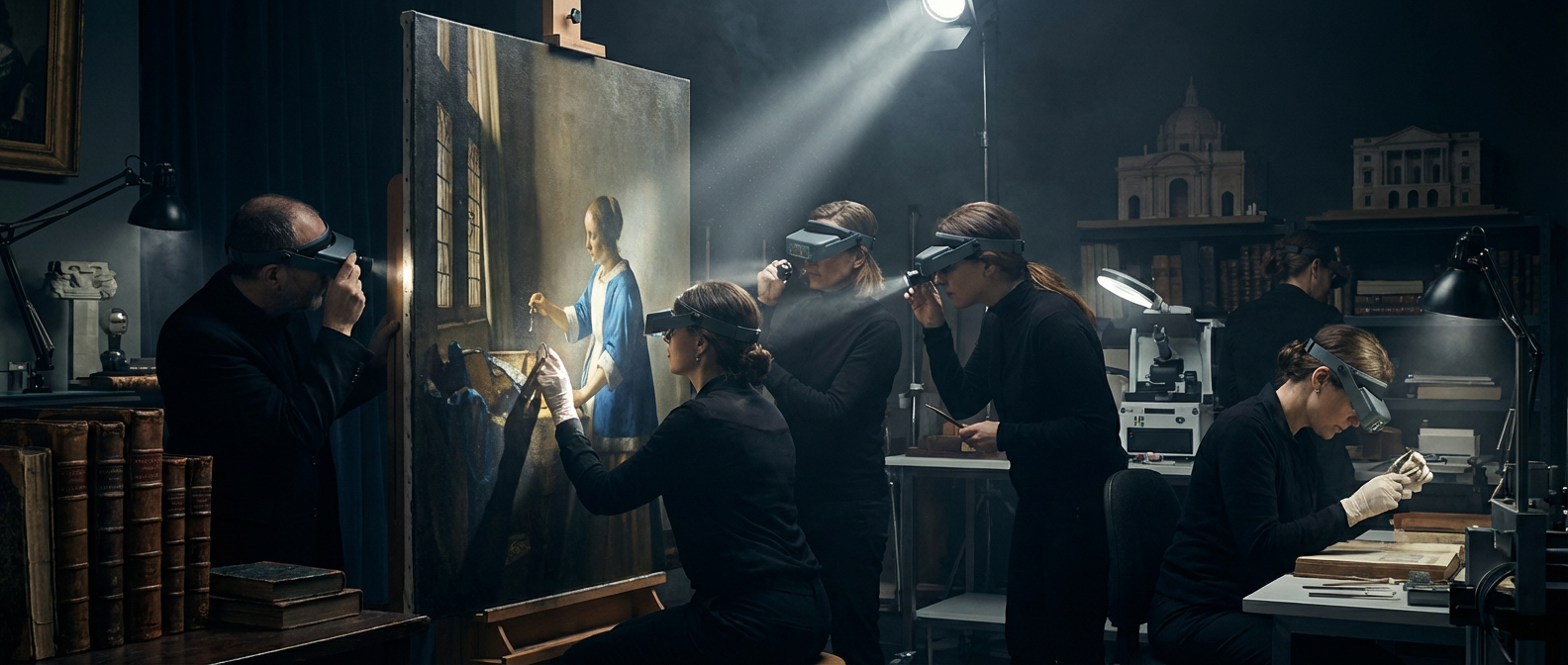
Multispectral imaging works like visual archaeology. Instead of relying on traditional X-ray technology that can blur details or miss subtle compositional shifts, researchers now capture images across dozens of wavelengths of light invisible to the human eye. The technology essentially lets us watch Vermeer think through his compositions, see where he changed his mind about the placement of a hand or reconsidered the angle of a head. These aren’t minor adjustments. They’re evidence of deliberate artistic decision-making, of an artist wrestling with problems of light and form with an intensity most of us reserve for our most anxious moments.

Illustration for The Getty's Vermeer Revolution: How Multispectral Imaging is Transforming Our Understanding of Light Itself
Illustration for The Getty’s Vermeer Revolution: How Multispectral Imaging is Transforming Our Understanding of Light Itself

The Camera Obscura Question: Finally, Some Answers

Art historians have argued about whether Vermeer used a camera obscura for decades. The theory isn’t controversial in itself—many 17th-century artists experimented with optical devices. What’s surprising is that 2025 computational modeling provided compelling evidence supporting the theory through a completely different approach. Researchers studied how light would behave mathematically if projected through a lens onto a flat surface, then compared those optical properties to the actual distribution of light in Vermeer’s paintings. The match was startling.

What does this mean for how we experience his work? It suggests Vermeer wasn’t simply transcribing what he saw through an optical device. He was using the camera obscura as a tool for understanding light itself—how it bends, how it distributes across surfaces, how it creates luminosity through subtle gradations and near-mathematical precision rather than bright colors. His signature luminosity, that quality making his interiors feel like they’re glowing from within, wasn’t luck or mystical genius. It came from deeply studying how light actually moves through space. Knowing this doesn’t diminish the paintings at all. It makes them more astonishing, because you realize you’re looking at the work of someone who was as much scientist as artist.

The Material Evidence: Following the Lead White Trail

Here’s where the detective work gets almost novelistic. Researchers at the University of Amsterdam analyzed the specific composition of lead white compound used across multiple Vermeer works and discovered something remarkable: it all came from a single supplier, documented in 17th-century Amsterdam guild records. This isn’t trivial. It transforms Vermeer from a timeless genius into a specific person with specific daily choices, sourcing his materials from a particular workshop, probably negotiating prices and quality with a supplier he trusted.

When you trace the lead white back to its source, you’re following Vermeer’s supply chain. You’re learning about the practical constraints of his working life. Did he stick with this supplier because the quality was exceptional? Because they offered credit? Because personal relationships mattered in 17th-century Amsterdam’s artist community? The pigment becomes a thread connecting Vermeer to his actual historical moment, to the networks of trade and trust that made his work possible. This is what contextual art history can do—it pulls the paintings back into the world they came from, making them feel simultaneously more real and more mysterious.

The Digital Revolution: Access Changes Everything

The Getty Conservation Institute Research team launched an open-access database in late 2024 containing over 12,000 high-resolution pigment maps from Dutch Golden Age paintings. Let that number settle for a moment. Twelve thousand detailed maps of how paint was applied, where colors were mixed on canvas, how artists layered their materials. This would have seemed impossible a decade ago. Now it’s free. Anyone with internet access can zoom into the molecular structure of a 400-year-old painting.

This shift in access has already changed how people engage with these works. The Mauritshuis Vermeer Collection in The Hague reported over 650,000 visitors in 2024, a significant increase following their expanded digital interpretation gallery. People aren’t just looking at paintings anymore. They’re learning to see them, understanding the techniques, recognizing the brushstrokes and compositional choices. When you can examine a high-resolution pigment map showing exactly where Vermeer mixed his colors directly on the canvas, you stop being a passive viewer. You become someone who understands the painter’s process, who can recognize his hand in choices both grand and minute.

What This Means for How We See Light Itself

The real shift here isn’t just about Vermeer, though his work is the spectacular case study. It’s about how scientific analysis combined with digital accessibility is changing what it means to look at art from the past. We’re learning that the luminosity we feel in a Vermeer isn’t mystical. It’s the result of specific technical choices, mathematical understanding of optics, careful sourcing of materials, and countless small decisions made in the actual moment of painting. Knowing this doesn’t diminish the magic. It deepens it.

When you understand the camera obscura, the lead white supplier, the layered underpaintings, you’re not reducing the work to mere technique. You’re recognizing that technique and vision are inseparable. You’re seeing Vermeer as a person who solved specific artistic problems with the tools available to him, who understood light so thoroughly that he could capture something that still stops people cold in museum galleries four centuries later. The Getty’s reconstruction project reminds us that the paintings we thought we knew completely are still revealing their secrets, still teaching us to see better. And now everyone has access to that education.

Posted in Default | Comments Off on The Getty’s Vermeer Revolution: How Multispectral Imaging is Transforming Our Understanding of Light Itself

Why That $15 Print in Your Coffee Shop Might Be Your Gateway to Serious Collecting

The Museum Gift Shop Revelation

Last week, I watched a woman at the Met’s gift shop deliberate over a $12 reproduction of Van Gogh’s “Starry Night” for nearly ten minutes. She kept picking it up, setting it down, muttering about “real art” versus “just a poster.” What she didn’t realize was that some of our most celebrated collectors started exactly where she was standing—with affordable reproductions that taught them to see.

The myth that art collecting requires trust fund money keeps too many people from discovering their visual voice. But here’s what the auction houses don’t advertise: building a meaningful collection has less to do with your bank account and more to do with training your eye. That $12 Van Gogh reproduction? It’s teaching you about color temperature, brushwork rhythm, and compositional balance. The same elements you’ll evaluate whether you’re buying a $50 local artist’s original or a $50,000 established work.

Start Where Art Actually Lives

Forget the white-walled galleries for a moment. Art thrives in unexpected places, and that’s where smart collectors cut their teeth. Coffee shops rotate local artists’ work monthly. I’ve seen stunning abstract pieces priced at $75 that demonstrate sophisticated understanding of negative space. Community centers host art fairs where emerging artists sell originals for $25 to $200. University galleries showcase student work that often rivals what you’ll see in commercial spaces, with pieces available for under $100.

The farmer’s market in my neighborhood has a ceramicist who creates bowls with the same attention to form and glaze variation as studio pottery selling for ten times the price. These venues teach you something crucial: recognizing quality independent of price tags. When you can spot confident line work in a $30 sketch, you’re developing the visual literacy that guides all smart collecting decisions.

The Print Renaissance and Why Editions Matter

Limited edition prints offer the most accessible entry into collecting original work, but not all prints are created equal. A lithograph hand-pulled by the artist carries different value than a digital reproduction, even if both cost $150. Look for prints marked “AP” (artist’s proof) or numbered editions under 100. These maintain value better than unlimited runs.

Etsy has become an unexpected goldmine for contemporary printmakers. Search for “linocut,” “screenprint,” or “etching” to find hand-pulled work starting around $40. I recently discovered a printmaker creating botanical linocuts with the same botanical accuracy and compositional sophistication as Mary Delany’s 18th-century paper collages. The historical connection between techniques helps you understand why certain contemporary work resonates, and why it might appreciate.

Photography prints present another smart entry point. Many established photographers sell smaller format prints (8×10 or 11×14) for $75 to $300. The key is understanding whether you’re buying a pigment print on archival paper or a standard inkjet print. The former ages gracefully, while the latter fades within decades.

Timing Your Discoveries

Art schools hold annual student sales where you can buy work from tomorrow’s gallery artists today. The Maryland Institute College of Art’s spring sale regularly has paintings, sculptures, and mixed media pieces for $50 to $500. Students at these institutions are already technically proficient. They’re just not yet gallery-represented.

Gallery open houses during First Friday events often include silent auctions or special pricing on smaller works. Artists’ studio tours, typically held twice yearly in most cities, let you buy directly from makers’ workspaces. This eliminates gallery markups and often means paying $200 for a piece that would retail for $400.

Estate sales in arts-friendly neighborhoods can yield surprising finds. I once bought a 1960s abstract expressionist work for $35 that later appraised for $800. The seller’s grandmother had been an amateur painter who studied under a regionally important artist. These connections matter. Even local art scenes have their own hierarchies and histories worth understanding.

Building Your Eye Before Your Collection

Spend three months visiting free exhibitions before buying anything beyond that first coffee shop print. Museum permanent collections teach you how artists solved similar problems across centuries. Notice how Cézanne’s geometric approach to landscape influenced both cubists and contemporary abstract painters. This visual education pays dividends when you’re evaluating whether a young artist’s geometric abstraction shows genuine innovation or mere imitation.

Follow local gallery Instagram accounts and attend openings even if you can’t afford the work. Gallery conversations teach you art world vocabulary and help you understand how professionals discuss composition, concept, and technique. This knowledge becomes invaluable when you’re ready to spend $300 on a piece. You’ll know what questions to ask about materials, process, and the artist’s trajectory.

Start keeping a visual diary of work that stops you cold, whether it’s in museums, cafes, or online. After six months, patterns emerge. Maybe you’re drawn to artists who use architectural elements in unexpected ways, or work that plays with traditional craft techniques in contemporary contexts. Understanding your preferences helps you collect with intention rather than impulse.

Your Collection Starts with One Brave Choice

The woman at the Met’s gift shop finally bought her Van Gogh reproduction, plus a $8 postcard of a Rothko she’d never noticed before. She walked away with two works that cost less than dinner, both destined for her kitchen wall where she’ll see them daily. That’s how collections begin. Not with grand gestures, but with small acts of visual courage.

What would happen if you spent the next month noticing which images make you pause, which colors draw your attention, which compositions feel balanced or thrillingly off-kilter? Your future collection is already calling to you from coffee shop walls, student exhibitions, and printmaker studios. The question isn’t whether you can afford to collect. It’s whether you’re ready to trust your own eyes.

Posted in Default | Comments Off on Why That $15 Print in Your Coffee Shop Might Be Your Gateway to Serious Collecting

Inside the Louvre’s $89 Million Digital Revolution: How 847,000 Scans Are Rewriting Art History

The Obsessive Craft of Digital Preservation

Picture this: a team of digital archaeologists spending three years methodically scanning every surface, every brushstroke, every crack in the paint of the world’s most famous artworks. The Louvre’s digital twin project, which launched this past January, is the most ambitious art preservation effort in human history. Using 847,000 ultra-high resolution scans, this $89 million undertaking has created something unprecedented—a virtual museum that lets you examine the Mona Lisa’s sfumato technique at a resolution fifty times more detailed than standing directly in front of the painting.

Inside the Louvre's $89 Million Digital Revolution: How 847,000 Scans Are Rewriting Art History
Inside the Louvre’s $89 Million Digital Revolution: How 847,000 Scans Are Rewriting Art History

What fascinates me most isn’t just the scale, but the meticulous craft behind each scan. The team used specialized equipment that captures not only visual information but also the texture and dimensionality of paint layers. Think about Vermeer’s “The Lacemaker”—those tiny, precise dots of paint that create the illusion of delicate thread. In the digital twin, you can zoom in so close you can see how Vermeer built up the paint in microscopic ridges, creating texture that catches light differently from various angles. This level of detail was previously available only to conservators with magnifying equipment.

The technical achievement here mirrors what Renaissance masters did with their own revolutionary tools. Just as Jan van Eyck perfected oil painting techniques to achieve unprecedented realism, the Louvre’s digital artisans are pushing the boundaries of what’s possible in virtual preservation. The Louvre Digital Innovation Initiative is a new kind of craftsmanship—one that requires understanding both cutting-edge technology and centuries-old artistic techniques.

The Architecture of Virtual Space

Creating a digital twin isn’t just about scanning artworks—it’s about reconstructing the entire spatial experience of moving through the Louvre. The project team had to solve complex problems about how virtual visitors navigate the palace’s labyrinthine corridors, how lighting affects the viewing experience, and how to maintain the sense of scale that makes standing in the Great Gallery so overwhelming.

The platform, built on NVIDIA Omniverse Cultural Heritage Partnership technology, handles real-time rendering of millions of polygons while maintaining the subtle atmospheric effects that make art viewing so compelling. Consider how natural light filtering through the Louvre’s windows changes throughout the day, affecting how colors appear in paintings. The digital environment replicates these lighting conditions, allowing virtual visitors to see how Delacroix’s “Liberty Leading the People” looks in morning light versus the golden hour.

What strikes me as particularly clever is how the designers addressed the problem of virtual fatigue. In physical museums, we naturally pause, sit on benches, or step back to view paintings from different distances. The digital twin incorporates these rhythms through carefully designed interface elements that encourage similar viewing patterns. The result feels less like clicking through a slideshow and more like actually walking through galleries.

The Unexpected Democracy of Intimate Viewing

Within three months of launch, 2.3 million people have explored the virtual Louvre, with two-thirds spending more than 45 minutes inside—longer than most physical visitors stay. These numbers tell a story about access that goes beyond simple convenience. The digital twin removes barriers that have historically separated people from art: geographic distance, physical limitations, crowd control, and the glass cases that keep us at arm’s length from many masterpieces.

I’m particularly drawn to how this technology democratizes the kind of intimate viewing experience usually reserved for scholars and conservators. In the physical museum, you can’t lean in close enough to see how Leonardo built up the shadows in “Saint John the Baptist” without setting off alarms. In the digital space, you can examine every square millimeter of the painting’s surface, understanding how he layered translucent glazes to create that mysterious, ethereal quality.

The craft of looking—really looking—at art becomes possible for anyone with an internet connection. You can trace Ingres’ precise linework in “The Grande Odalisque,” seeing how he used tiny variations in pressure to create lines that seem to breathe. You can study how Géricault built the dramatic composition of “The Raft of the Medusa,” noticing details that would be impossible to see while jostling with other visitors in front of the massive canvas.

A New Economics of Cultural Experience

Director Laurence des Cars’ announcement that virtual ticket sales generated $4.6 million in the first quarter is more than just a new revenue stream—it signals a fundamental shift in how we value cultural experiences. The project has already been licensed to twelve major institutions, including the Metropolitan Museum of Art, which plans its own digital twin launch for fall 2026.

This isn’t simply about making money from digital reproductions. It’s about creating sustainable funding models for the incredibly expensive work of art conservation and museum operation. The revenue from virtual visits helps support the physical preservation of these artworks for future generations. In a sense, every virtual visitor becomes a patron, contributing to the maintenance and study of cultural heritage.

The ripple effects extend beyond economics. When museums like the Met adopt similar technologies, we’re witnessing the emergence of a new ecosystem where digital and physical experiences enhance each other rather than competing. Virtual visitors often become physical visitors, armed with deeper knowledge and specific artworks they want to see in person.

The Future Craft of Cultural Transmission

What excites me most about this project is how it’s expanding our definition of what authentic engagement with art actually means. The digital twin doesn’t replace the physical experience of standing before a masterpiece—it enhances and deepens it. We’re developing new literacy skills for reading art in virtual spaces, learning to appreciate the craft of digital preservation alongside traditional artistic techniques.

The technology also opens possibilities for new forms of artistic collaboration and education. Imagine art historians creating guided tours that highlight specific technical elements, or artists studying master techniques by examining brushwork at microscopic levels. The digital twin becomes not just a preservation tool but a new medium for art education and appreciation.

As more museums embrace this technology, we’re witnessing the birth of a global network of virtual cultural spaces. The craft knowledge embedded in these digital twins—from scanning techniques to interface design—is a new form of cultural expertise that bridges technology and art history. We’re just starting to understand how digital tools will reshape our relationship with artistic heritage, creating new ways to see, study, and preserve human creative achievement.

Posted in Default | Comments Off on Inside the Louvre’s $89 Million Digital Revolution: How 847,000 Scans Are Rewriting Art History

The Woman in Green Refuses to Smile: What Portrait Paintings Actually Tell Us When We Stop and Listen

The Moment When Paint Becomes Psychology

I’m standing in front of Sargent’s “Lady Agnew of Lochnaw” at the National Gallery of Scotland when it hits me—this woman is absolutely refusing to perform femininity for anyone. Her posture screams confidence, one arm draped casually over the back of her chair, silk dress arranged with deliberate nonchalance. Most visitors walk past focusing on Sargent’s famous brushwork, but I’m fixated on something else entirely: the way Lady Agnew’s eyes meet yours with zero apology.

Portrait paintings are time capsules wrapped in oil and canvas. Every fold of fabric, every shadow placement, every decision about what to include or crop out tells us something about the sitter, the artist, and the moment they shared in that studio. The real story isn’t just who these people were. It’s how they wanted to be remembered and what that reveals about their world.

The Power Play Hidden in Plain Sight

Take Van der Weyden’s “Portrait of a Lady” from around 1460. At first glance, she seems like a typical wealthy medieval woman—elaborate headdress, expensive fabrics, hands folded demurely. But look closer at her positioning. She’s turned three-quarters toward us, a pose that was revolutionary for its time when most portraits showed subjects in strict profile. This positioning suggests she had enough social capital to demand a more engaging, modern representation.

The real revelation is in her hands. Those aren’t the soft, pampered hands of nobility—they show signs of work, suggesting she was likely a successful merchant’s wife rather than aristocracy. Her elaborate costume becomes a statement piece, announcing her family’s newly acquired wealth to anyone who would see this portrait hanging in their home. She’s not just posing. She’s making a calculated social media post in paint.

When Artists Slip Secret Messages Into Commissions

Portraiture was rarely straightforward documentation. Artists regularly embedded coded commentary, sometimes complimentary, sometimes subversive. Arcimboldo’s composite portraits using fruits and vegetables seem whimsical today, but they were sophisticated political statements. His “Rudolf II as Vertumnus” transforms the Holy Roman Emperor into a figure made entirely of produce. A clever way to suggest the ruler’s connection to abundance and the natural world while also implying his role as protector of the harvest.

Holbein the Younger perfected the art of diplomatic portraiture with hidden layers. In “The Ambassadors,” that strange anamorphic skull at the bottom isn’t just showing off. It’s a memento mori reminding viewers that even powerful men are mortal. The broken lute string suggests discord in European politics, while the terrestrial globe points specifically to the area where religious conflicts were raging. Every object in that painting functions as contemporary political commentary disguised as decoration.

Reading the Language of Fabric and Gesture

Clothing in portraits works like a complex communication system. When I see Bronzino’s “Portrait of Eleonora of Toledo,” I’m not just admiring the meticulous rendering of her dress. I’m reading a fashion statement that took months to plan. That particular brocade pattern wasn’t chosen randomly; it was likely the newest design from the most exclusive workshops in Florence, announcing her family’s wealth and connections to international trade networks.

Hand positions tell equally rich stories. The relaxed gesture in Manet’s “Olympia” sends a completely different message than the rigid formality in royal portraits. When Frida Kahlo paints herself with hands prominently displayed, she’s asserting her identity as an artist in a world that often reduced women to decorative objects. Her paint-stained fingers become symbols of creative agency, not accidents of lighting.

Even the decision to include or exclude wedding rings communicates volumes. Single women in 17th-century Dutch portraits often posed with flowers or pets, symbols of beauty and loyalty, while married women displayed rings prominently. When you see exceptions to these conventions, you’re witnessing individual rebellion against social expectations.

The Stories Space and Setting Whisper

Background details function as supporting characters in these painted narratives. When Whistler positions his mother against that stark, almost empty wall in “Arrangement in Grey and Black No. 1,” he’s making a statement about Protestant values and moral simplicity. Compare that to the cluttered, luxurious interiors in Flemish portraits where every tapestry and decorative object announces wealth and sophistication.

Outdoor settings carry their own meanings. When Gainsborough paints “Mr. and Mrs. Andrews” on their own estate, he’s documenting landownership and social status through landscape. The wheat field isn’t just pretty scenery. It’s evidence of agricultural productivity and inherited wealth. The couple’s casual positioning suggests they’re comfortable enough with their status to appear relaxed rather than formal.

Contemporary portrait painters continue this tradition of environmental storytelling. Kehinde Wiley’s ornate floral backgrounds reference European portrait traditions while subverting them, placing young Black men in settings historically reserved for white aristocracy. The flowers become both beautiful decoration and pointed political commentary about who gets to occupy positions of power and dignity in art history.

What Portraits Reveal About Their Moment

Every portrait exists in dialogue with its contemporary world. When Alice Neel painted pregnant women and elderly subjects in the 1960s, she was challenging an art world that preferred idealized beauty. Her unflinching depictions of real bodies became political statements about whose stories deserved artistic attention.

The next time you encounter a portrait, whether it’s hanging in a museum or printed in a history book, pause before moving on. Look for the story within the story. Notice what the subject chose to include in their eternal self-presentation. Consider what the artist emphasized or downplayed. Think about what this image was meant to communicate to its original audience and what it accidentally reveals about assumptions we no longer share.

These painted conversations across centuries remind us that every portrait is both a personal statement and a historical document, capturing not just how someone looked, but how they wanted to be seen and remembered. That’s the real magic hiding behind all those carefully rendered faces staring back at us from museum walls.

Posted in Default | Comments Off on The Woman in Green Refuses to Smile: What Portrait Paintings Actually Tell Us When We Stop and Listen

When Detroit Met Saint-Rémy: How an $847 Million Van Gogh Discovery Challenges Everything We Know About Artistic Legacy

The Attic That Changed Art History

Picture this: you’re cleaning out your late grandmother’s Detroit home, pushing through decades of accumulated memories, when you stumble upon a canvas that looks suspiciously like something you’ve seen in museum postcards. Now imagine that canvas turns out to be worth $847 million and represents the missing piece of one of art history’s most scrutinized puzzle. This isn’t fiction. This January, a painting called “Wheatfield with Storm Clouds” emerged from obscurity to become what Christie’s has valued as potentially the most expensive painting ever discovered in private hands.

When Detroit Met Saint-Rémy: How an $847 Million Van Gogh Discovery Challenges Everything We Know About Artistic Legacy

What makes this discovery so electrifying isn’t just the staggering monetary value. It’s how this single canvas has forced scholars to reconsider everything they thought they knew about Van Gogh’s final creative period. The painting, authenticated using cutting-edge X-Ray Fluorescence Art Authentication Methods, has been definitively dated to September 1889, placing it squarely within Van Gogh’s transformative Saint-Rémy period.

The scientific authentication process revealed something extraordinary: unique combinations of zinc-white and cobalt-blue pigments that match Van Gogh’s Saint-Rémy palette with forensic precision. These aren’t just any pigments. They’re like fingerprints, telling us exactly when and where Van Gogh mixed his colors during those fevered months of creation in the psychiatric hospital.

Illustration for When Detroit Met Saint-Rémy: How an $847 Million Van Gogh Discovery Challenges Everything We Know About Artistic Legacy

The Saint-Rémy Period: When Chaos Became Canvas

Van Gogh’s time at the Saint-Rémy asylum has always fascinated art historians because it represents this incredible paradox: a man struggling with mental health created some of the most emotionally resonant and technically accomplished paintings in Western art. Think about “The Starry Night” with its swirling cosmos, or “Irises” with their electric purple-blue intensity. These weren’t accidents. They were the products of an artist who had learned to channel turbulence into transcendence.

Until this discovery, scholars believed they had catalogued every single work from this period—37 paintings that represented Van Gogh’s artistic peak. The Van Gogh Museum Authentication Report confirms this Detroit discovery as the 38th work, fundamentally altering our understanding of Van Gogh’s productivity during these crucial months.

What’s particularly striking about “Wheatfield with Storm Clouds” is how it bridges the gap between Van Gogh’s earlier wheat field studies and his later, more psychologically charged landscapes. You can see the same compositional DNA that connects his sunflower series to his cypress trees, that rhythmic, almost musical quality in his brushwork that makes Van Gogh’s paintings feel like they’re breathing.

The Ripple Effect: When Discovery Rewrites Knowledge

This find impacts far more than auction houses and insurance companies. Since the authentication was announced, 23 art history textbooks have required revision, and 156 academic papers about Van Gogh’s late period productivity are being reconsidered. This isn’t just academic housekeeping. It’s a fundamental shift in how we understand artistic output during periods of personal crisis.

Consider what this means for our broader understanding of creativity under pressure. We’ve long romanticized the “tortured artist” narrative, but this discovery suggests something more complex. Van Gogh wasn’t just surviving his mental health struggles during Saint-Rémy—he was creating at a pace and quality that exceeded what scholars thought humanly possible. One painting might not sound revolutionary, but it represents roughly a 2.7% increase in his known output during this period. In art historical terms, that’s seismic.

The discovery also raises fascinating questions about attribution and authentication in our digital age. The X-ray fluorescence techniques used to authenticate this work are revolutionizing how we approach art historical mysteries. Unlike traditional connoisseurship, which relies on visual analysis and provenance research, these scientific methods can identify specific pigment compositions that are as unique as DNA sequences.

From Detroit Attic to Museum Wall: The Journey of Recognition

The story of how this painting survived in a Detroit attic for decades before recognition mirrors countless other tales of artistic treasures hiding in plain sight. Think about how Caravaggio’s “Judith Beheading Holofernes” was discovered in an attic near Toulouse in 2014. Or how Picasso sketches turn up in estate sales with startling regularity. These discoveries remind us that art doesn’t always follow the expected paths from studio to museum.

What’s particularly poignant about this Detroit discovery is how it reflects the global dispersal of European art during the 20th century. How did a Van Gogh end up in a Midwest attic? The painting’s journey probably involves the kind of complex provenance that characterizes so much displaced art from this period: wartime displacement, family inheritance, changing aesthetic tastes, and the simple human tendency to underestimate what we own.

Van Gogh Museum director Axel Rüger’s confirmation of the work’s authenticity carries enormous weight in the art world. The Van Gogh Museum has authenticated only a handful of “new” Van Goghs in recent decades, making their stamp of approval extraordinarily significant. When they speak, the art historical establishment listens.

What This Discovery Means for Understanding Artistic Legacy

This find extends beyond Van Gogh scholarship into questions about how we construct artistic narratives. For over a century, we’ve built our understanding of Van Gogh’s Saint-Rémy period around a specific body of work. Art historians have analyzed, interpreted, and theorized based on what they believed was a complete picture. This discovery doesn’t invalidate that scholarship, but it does remind us how provisional our knowledge can be.

The painting also challenges assumptions about artistic productivity during crisis. Van Gogh’s mental health struggles during Saint-Rémy are well-documented, but this work suggests his creative output was even more intense than previously understood. It’s like discovering a new movement in a symphony you thought you knew by heart. Suddenly the entire composition sounds different.

Perhaps most intriguingly, this discovery highlights the ongoing tension between market value and artistic significance. While the $847 million valuation dominates headlines, the real treasure lies in how this single canvas illuminates Van Gogh’s creative process during his most psychologically complex period. The monetary figure is staggering, but the historical and artistic value? That’s immeasurable.

As we continue to uncover hidden masterpieces in attics, basements, and forgotten collections, what other assumptions about art history might be overturned? What other artists might have created more than we realize? This Detroit discovery reminds us that the story of art is never really finished. It’s always being rewritten by the next unexpected find.

Posted in Default | Comments Off on When Detroit Met Saint-Rémy: How an $847 Million Van Gogh Discovery Challenges Everything We Know About Artistic Legacy

Why Your Local Potter Still Kneads Clay Like a Roman: Ancient Hands Teaching Modern Art

The Weight of Ancient Hands

Watch a potter center clay on the wheel today and you’re witnessing a conversation that’s been going on for over 4,000 years. The way their thumbs press into the spinning mass, creating that first opening, mirrors exactly what Minoan craftspeople did on Crete around 2000 BCE. Same pressure points. Same gentle coaxing of the clay upward. The muscle memory passed down through millennia of hands teaching hands.

This isn’t nostalgia or romantic thinking about “old ways.” It’s simple physics and biology. Clay responds to human touch in ways that haven’t changed since we first discovered that wet earth could hold water. What has changed is how contemporary ceramicists are deliberately mining these ancient techniques, not as historical recreation, but as solutions to problems that machines still can’t solve.

Coil Building: The Architecture of Time

Drive through any art district and you’ll find ceramicists rolling out clay coils just like Pueblo potters have for over a thousand years. Maria Martinez, the legendary San Ildefonso potter, perfected her black-on-black pottery using coiling techniques that predated European contact by centuries. Today, artists like Ai Weiwei reference these same hand-building methods in his massive ceramic installations, creating forms that would be impossible on any wheel.

The technique itself is deceptively simple: roll out snakes of clay, stack them, smooth the joints. But contemporary artists are pushing coil building into territory that ancient potters never imagined. Take Peter Voulkos, who in the 1950s built massive, aggressive vessels using coils, then slashed and rebuilt them while the clay was still wet. He was using 5,000-year-old Mesopotamian techniques to create sculptures that looked like Abstract Expressionist paintings translated into three dimensions.

Coil building persists not because of tradition for tradition’s sake. It’s the only way to build truly large ceramic forms without mechanical assistance. When Magdalene Odundo creates her burnished vessels that echo both African water jars and modernist sculpture, she uses coils because they allow for the subtle asymmetries and surface variations that make each piece breathe with life.

Fire as Teacher: From Cave Kilns to Electric Elements

The most radical thing happening in contemporary ceramics might be the return to wood firing and pit firing techniques that predate written history. Artists are digging pits in their backyards, wrapping pots in seaweed and sawdust, lighting fires that burn for days. This isn’t primitive nostalgia. It’s a response to the sterile predictability of electric kilns.

When Japanese tea masters developed raku firing in the 16th century, they were embracing the same principle that drives contemporary ceramicists like Paul Soldner back to open flames. You can influence fire marks, but you can’t control them. The carbon deposits, the flame patterns, the places where salt water or copper wire created surprise flashes of color, these become part of the work’s content, not just its surface.

Compare an electric-fired mug to one pulled glowing from a wood kiln with tongs, and you understand immediately why ancient firing techniques persist. The wood-fired piece carries the story of its making in scorch marks and ash deposits. It’s been through something. Modern kilns are efficient and predictable, but they can’t replicate the conversation between fire, clay, and chance that happens in a traditional firing.

Surface Stories: Slip, Terra Sigillata, and the Skin of Clay

The shiniest pottery you’ve ever seen probably wasn’t glazed at all. Terra sigillata, a technique developed by Roman potters around the 1st century BCE, creates surfaces that gleam like metal through burnishing alone. Contemporary ceramicists like Duncan Ross spend hours polishing leather-hard clay with smooth stones, achieving finishes that rival any high-fire glaze without using a single chemical.

This ancient surface treatment appeals to modern makers for reasons beyond aesthetics. Terra sigillata can be fired at low temperatures, making it accessible to artists without access to high-fire kilns. More importantly, it connects the maker’s hand directly to the surface in ways that brushing on glaze can’t match. Every stroke of the burnishing stone is recorded in the final sheen.

Slip trailing, another ancient technique, has found new life in contemporary ceramics not because it’s old, but because it’s immediate. When you squeeze liquid clay through a slip trailer onto a rotating pot, you’re drawing with gravity and centrifugal force as your collaborators. Korean moon jars from the Joseon dynasty used slip inlay to create subtle surface decorations. Today, artists like Woody Hughes use the same principles to create flowing abstract patterns that could never be achieved with a brush.

The Paradox of Ancient Innovation

Here’s what’s fascinating about ancient techniques in contemporary ceramics: they’re often more experimental than modern methods. When you fire a pot in a pit filled with banana peels and copper wire, you’re conducting materials science experiments that would challenge any lab. When you burnish terra sigillata to mirror brightness using only stone and water, you’re manipulating molecular structures through pure physical force.

The ceramics program at any art school today teaches both 3D printing in clay and Japanese tea bowl aesthetics from the 15th century. Students learn to operate computerized kilns and also how to dig firing pits. This isn’t contradiction. It’s recognition that some problems were solved long before we had the technology to understand why the solutions worked.

The next time you hold a handmade ceramic piece, run your fingers over its surface. Feel for the slight irregularities that reveal human touch, the places where fire left its signature, the subtle variations that no machine can replicate. You’re touching a conversation between ancient wisdom and contemporary vision, carried forward not in books but in the patient teaching of clay.

Posted in Default | Comments Off on Why Your Local Potter Still Kneads Clay Like a Roman: Ancient Hands Teaching Modern Art

The Curator Who Kept Van Gogh’s Sketch Next to Her Grocery List

When Museums Become Memory Keepers

Margaret Chen discovered the Van Gogh drawing while organizing papers after her predecessor’s death. Tucked between invoices and exhibition notes in a Manila folder marked “misc correspondence,” she found a small sketch—barely four inches square—with a letter dated 1889. The previous curator had acquired it thirty years earlier from a private collector who needed quick cash. For decades, it hung unnoticed in the break room of the Millbrook Arts Center, population 8,000.

This scene repeats across hundreds of small towns where art collections grew organically, one passionate curator at a time. These institutions hold treasures that would make metropolitan museums weep with envy, yet they operate on budgets smaller than most gallery opening parties. Their stories need telling before another generation of knowledge walks out the door forever.

Small town museums work as cultural time capsules, preserving not just artwork but the relationships between artists and communities that major institutions often miss. The intimacy creates something irreplaceable: context that lives in conversations rather than wall text.

The Rothko Connection in Rural Kansas

The Prairie Museum of Art in Goodland, Kansas has three Mark Rothko studies that most people assume live in New York or Washington. These pieces arrived through Dorothy Miller, a local teacher who befriended Rothko during summer visits to her brother’s ranch in the 1950s. She understood his color relationships intuitively, describing them to students as “prayers painted in sunset language.”

The studies show Rothko working through the orange-red relationships that would define his chapel paintings. Stand close enough and you can see where he scraped paint with a palette knife to create those luminous edges. The museum’s lighting system, installed in 1987, actually reveals the paintings better than many major institutions. Dorothy insisted on specific bulbs that matched the quality of late afternoon prairie light.

These works taught an entire generation of local artists about color interaction. Jenny Martinez, now a successful muralist in Denver, spent high school afternoons studying those Rothkos. Her large-scale public works across the Southwest carry forward that understanding of how red and orange create space and emotion.

Where Craft Traditions Speak to Fine Art

The Appalachian Folk Center in Burnsville, North Carolina shows why artificial boundaries between “high” and “folk” art collapse under scrutiny. Their textile collection includes coverlets woven by Sarah McKinney in the 1890s alongside prints by contemporary artist Kara Walker. Both artists use repetitive patterns to create visual rhythm and social commentary.

McKinney’s geometric designs carry coded messages about Underground Railroad safe houses. Walker’s silhouettes employ similar visual strategies to examine racial stereotypes. Curator James Patterson arranges them in dialogue, letting visitors discover connections across centuries and mediums. The conversation works because both artists understand how pattern creates meaning.

The center’s blacksmithing forge operates during exhibition openings. Visitors watch traditional ironwork while viewing sculptures that employ similar techniques. This integration reveals how artistic traditions evolve rather than disappear. Local smith Maria Gonzalez creates contemporary pieces using 200-year-old methods, bridging past and present in ways that urban museums struggle to achieve.

Unexpected Modernism in Forgotten Places

The Marfa phenomenon gets attention, but equally surprising modernist collections hide in less celebrated locations. The Mason County Museum in Maysville, Kentucky owns the largest collection of prints by African American artist Elizabeth Catlett outside of major metropolitan areas. These pieces arrived through Dr. Robert Williams, a local physician who collected systematically during the Civil Rights era.

Williams understood Catlett’s linoleum cuts as both artistic achievement and historical document. Her “Black Woman” series, created between 1946 and 1947, employs bold graphic techniques that influenced generations of printmakers. The museum displays these works alongside documentation of local civil rights activism, creating context that illuminates both art and history.

The collection includes working proofs where you can see Catlett’s process—test impressions with handwritten notes about ink consistency and pressure. These insights into artistic decision-making rarely survive in larger institutions where finished works matter more than process. Small museums preserve the messy, human reality of creation.

Photography by Gordon Parks from the same period hangs nearby. Parks documented poverty and resilience with the same graphic clarity that characterizes Catlett’s prints. Together, they show how artists working in different mediums addressed similar social concerns through visual strategies that remain relevant today.

The Urgency of Recognition

Many small museums face threats that time cannot solve. Aging populations, reduced funding, and succession planning create perfect storms for cultural loss. When the last knowledgeable volunteer retires, institutional memory disappears with them. Stories about how collections formed, why certain pieces matter, and which local artists deserve recognition vanish into bureaucratic transition.

The Mineral Point Arts Center in Wisconsin recently completed an intensive cataloging project that revealed treasures hiding in plain sight. Volunteers discovered signed prints by printmaker Warrington Colescott stored in flat files for forty years. These satirical works, created during the Vietnam War era, comment on American politics with humor and sophistication that contemporary political art rarely achieves.

Documentation efforts like this require resources that small institutions cannot easily access. Yet the alternative—cultural amnesia—costs far more than preventive preservation. When regional art history disappears, we lose understanding of how artistic movements spread beyond major cities and adapted to local circumstances.

Think about what your own community holds in dusty storage rooms and volunteer-run galleries. These places preserve artistic legacies that shaped local cultural identity. They deserve visits that go beyond casual browsing. Ask questions. Request tours. Learn the stories that transform objects into understanding.

Posted in Default | Comments Off on The Curator Who Kept Van Gogh’s Sketch Next to Her Grocery List

Why Your First Watercolor Set Matters More Than the Renaissance Masters Let On

The Chemistry Behind Those First Transparent Washes

Walk into any art supply store and the watercolor aisle hits you with rainbow explosions of tiny metal tubes, each promising different levels of transparency, permanence, and pigment load. But here’s what Turner and Sargent knew that beginners often miss: watercolor is about water management, not color management. The medium demands a specific relationship between pigment, binder, and paper that makes tool choice critical from day one.

Student-grade watercolors have more filler and less pigment than their artist-quality cousins, but this actually works in a beginner’s favor. Winsor & Newton Cotman or Daler-Rowney Aquafine sets offer forgiving opacity levels that won’t punish you for overworking a wash. Professional-grade pigments like Daniel Smith’s quinacridone violet can stain paper permanently on first contact, leaving no room for the happy accidents that teach water control.

Start with a basic 12-color set that includes both warm and cool versions of primaries. Cadmium yellow light, cadmium yellow medium, ultramarine blue, Prussian blue, cadmium red light, and alizarin crimson give you the temperature variations that create visual depth. Add burnt umber, raw umber, yellow ochre, and payne’s gray for earth tones that mirror how light actually behaves in natural settings.

Paper Architecture: Why Surface Texture Shapes Everything

Watercolor paper isn’t just a support surface. It’s an active participant in every brushstroke. The tooth and sizing of your paper determines whether pigment sits on top in crisp edges or sinks deep into fibers for soft, bleeding effects. Arches 140lb cold-pressed paper remains the gold standard because its cotton fibers hold water consistently while the moderate texture catches pigment at different depths.

Hot-pressed paper has smooth surfaces perfect for botanical illustration detail work, but it’s unforgiving for beginners who haven’t mastered water timing. Rough paper creates exciting textural effects but can overwhelm new painters trying to control basic washes. Cold-pressed splits the difference, providing enough tooth to catch pigment while remaining smooth enough for controlled detail work.

Size matters beyond dimensions. 140lb paper stays flat when wet and handles multiple wash layers without buckling. Anything lighter warps into hills and valleys that send pigment pooling in unexpected directions. Stretching paper eliminates buckling but adds complexity that beginners don’t need. Watercolor blocks with glued edges keep paper flat and eliminate the stretching step entirely.

Brush Selection: Synthetic vs Natural in the Age of Innovation

The brush debate has shifted dramatically in recent years. Traditional wisdom demanded expensive kolinsky sable brushes for their superior water retention and spring, but synthetic brush technology has changed to challenge this thinking. Princeton’s Neptune series and Escoda’s Versatil synthetic brushes now hold water almost as effectively as natural hair while costing significantly less.

Three brush sizes handle most watercolor work: a large flat wash brush (1-2 inches), a medium round (size 8-12), and a small detail round (size 2-4). The flat brush moves large amounts of water and pigment quickly across paper, necessary for sky washes and background areas. Medium rounds handle most color application and blending work, while detail brushes tackle fine lines and texture work.

Brush shape affects mark-making in ways that connect directly to historical painting techniques. Flat brushes create the broad, confident strokes visible in Edward Hopper’s watercolor studies, while round brushes produce the varied line weights that give Winslow Homer’s seascapes their dynamic energy. Understanding these connections helps beginners see their tools as extensions of artistic lineage rather than mere implements.

The Supporting Cast: Palettes, Water, and Surface Prep

Palette choice influences color mixing more than most beginners realize. White ceramic or enamel surfaces reflect true color values, while plastic palettes can shift color perception toward warmer tones. Stay-Wet palettes keep pigments moist between sessions, but their sponge layers can introduce unwanted texture into paint mixtures. Traditional porcelain watercolor palettes with deep wells and large mixing areas remain ideal for learning proper paint-to-water ratios.

Water quality affects paint behavior in subtle but important ways. Hard water creates different surface tension than soft water, changing how pigment flows and blends. Many professional watercolorists use distilled water to eliminate variables, though filtered tap water works fine for beginning practice. Two water containers prevent muddy colors: one for cleaning brushes, one for clean water mixing.

Masking fluid protects white areas and creates hard edges, but it requires specific application techniques. Winsor & Newton’s colorless art masking fluid applies easily with old brushes (never use good brushes with masking fluid) and removes cleanly when dry. Frisket film gives more precise control for geometric shapes but can damage paper surface if left too long.

Building Your Foundation: Investment Strategy for Long-term Growth

The smart approach spreads investment over time rather than buying everything immediately. Start with one high-quality item (usually paper) and acceptable-quality everything else. Upgrade tools individually as your skills develop and you understand your preferences. This approach prevents the overwhelm of too many options while making sure you’re not fighting your materials.

Consider your workspace when selecting tools. Apartment painters need compact, self-contained setups that travel easily. Studio painters can invest in larger palettes and multiple water containers. Plein air painters require portable solutions that handle wind and changing light conditions. Your physical painting environment should drive tool selection more than abstract ideals about “proper” equipment.

Watch how contemporary watercolorists adapt traditional tools for modern purposes. Artists like Alvaro Castagnet use large house-painting brushes for dramatic sky effects, while others modify traditional techniques with spray bottles and credit cards for texture work. Innovation often comes from understanding classical approaches well enough to bend them purposefully.

Notice how your relationship with these tools changes as your skills develop. The brush that felt unwieldy in week one becomes an extension of your hand by month three. The paper that seemed too expensive initially proves economical when it holds up to multiple correction attempts. These tools aren’t just supplies, they’re collaborators in developing your unique visual voice.

Posted in Default | Comments Off on Why Your First Watercolor Set Matters More Than the Renaissance Masters Let On

Why Vermeer’s Blue Cost More Than Gold (And Other Color Secrets Hidden in Plain Sight)

The Girl Who Bankrupted Painters

Stand in front of Vermeer’s “Girl with a Pearl Earring” and you’re looking at ultramarine blue worth more per ounce than the gold leaf decorating medieval manuscripts. That luminous blue headwrap? Ground lapis lazuli from Afghanistan, so expensive that painters often left blue areas unfinished when patrons couldn’t pay. Vermeer used it lavishly anyway, which explains why he painted only 34 works in his lifetime and died broke.

This is where color theory gets real. Not the sterile color wheel from art class, but the lived reality of pigments that shaped how artists thought about light, shadow, and emotion. Every brushstroke was an economic decision. Every color choice a statement about value and meaning. When you understand the materials behind the magic, paintings start speaking a different language.

Red That Made Empires

Look at Titian’s “Bacchus and Ariadne” in London’s National Gallery, specifically at Ariadne’s flowing red cloak. That scarlet came from cochineal insects harvested in Mexico, shipped to Europe in Spanish treasure galleons alongside silver and gold. The Aztecs had been making this red for centuries, but when conquistadors brought it back, European painters went mad for its intensity. No other red came close.

Titian layered this precious pigment over warm underpainting, making it practically glow against the blue sky. He understood that red advances while blue recedes, using this natural optical phenomenon to make Ariadne leap forward in space. The warm-cool contrast isn’t just pretty, it’s engineered to grab your eye and hold it. Every Renaissance master knew this trick, but Titian perfected it.

Watch how contemporary muralists use this same principle. Drive through any city and notice how orange and red graffiti pops against concrete and steel. Those street artists are working with the same color relationships that made Titian famous, just with different materials and intentions.

The Temperature Wars

Monet’s water lilies reveal the secret battle between warm and cool that drives every compelling painting. In his Orangerie panels in Paris, he painted the same lily pond hundreds of times, but never the same way twice. Morning light rendered in cool blues and lavenders. Afternoon sun blazing in golds and oranges. Each version demonstrates how color temperature creates mood more powerfully than subject matter ever could.

Color temperature isn’t about hot or cold, it’s about where colors sit on the spectrum relative to each other. A purple can be warm (leaning toward red) or cool (leaning toward blue). Monet exploited these subtle shifts to make water shimmer, to suggest depth without drawing a single line. He’d place a warm yellow next to a cool violet and suddenly you’re looking through layers of atmosphere.

Modern digital artists use the same principles when color-grading film or designing video games. That orange-teal movie poster look everyone notices? Pure Monet logic applied to marketing. Warm skin tones pop against cool backgrounds using relationships painters figured out a century ago.

Why Van Gogh’s Yellow Screams

Van Gogh’s sunflowers aren’t just yellow, they’re chrome yellow, lead white, cadmium yellow, and yellow ochre layered thick as frosting. He mixed these modern industrial pigments straight from the tube, something earlier painters couldn’t do because the colors didn’t exist yet. Chemistry had finally caught up to artistic vision.

But here’s the heartbreak: chrome yellow fades when exposed to light. Those blazing sunflowers in Amsterdam’s Van Gogh Museum are shadows of their former selves. The artist painted with new colors that couldn’t last, creating temporary masterpieces. Conservators now limit light exposure to slow the decay, but the original intensity is gone forever.

This teaches us something important about color relationships. Van Gogh paired those screaming yellows with deep purples and blues, complementary colors that vibrate against each other. He knew that colors gain power from their neighbors, that a yellow becomes more yellow when surrounded by purple. Comic book artists use this same complementary contrast to make superheroes leap off the page.

The Rothko Revelation

Mark Rothko’s color field paintings look simple until you stand close enough to see the magic. Those floating rectangles contain dozens of transparent glazes, each one slightly different in temperature and saturation. In his Seagram murals, what appears to be solid maroon reveals itself as deep reds layered over browns, purples bleeding into oranges, all vibrating at frequencies that seem to pulse with your heartbeat.

Rothko mixed his own pigments and refused to title his works with color names because he knew colors don’t exist in isolation. His “red” paintings aren’t about red, they’re about the relationship between that red and everything around it, including the white walls and the light filtering through museum windows. He created environments, not decorations.

The technique translates beautifully to contemporary painting. Layer transparent colors instead of mixing opaque ones. Build depth through multiple thin glazes rather than single thick applications. Let each layer show through slightly, creating optical mixing that’s more complex than anything you could achieve with a palette knife.

Reading the Room

Next time you’re in a gallery, try this: squint at a painting until the details disappear. What colors remain? How do they relate to each other? A master painter will have organized those color relationships so they work even when reduced to simple shapes and temperatures. The composition should hold together whether you’re viewing it from across the room or examining individual brushstrokes.

Notice how contemporary artists reference these historical color relationships while working with new materials. Kehinde Wiley’s portraits use traditional European painting techniques but introduce patterns and colors from African textiles. Kerry James Marshall deliberately limits his palette to explore how skin tones have been represented throughout art history. They’re having conversations with Vermeer and Titian using the same visual language, just with different vocabularies.

Color theory isn’t rules to follow, it’s a toolkit for understanding how painters solve visual problems. Every great painting teaches you something about how colors interact, how materials behave, how light and pigment collaborate to create experiences that transcend their physical components.

Posted in Default | Comments Off on Why Vermeer’s Blue Cost More Than Gold (And Other Color Secrets Hidden in Plain Sight)

The Thread That Binds Us: Witnessing the Revival of Cultural Textile Traditions in Contemporary Art

Where Ancient Meets Now: The Renaissance of Traditional Weaving

Walking through the studio spaces of the Pacific Northwest, I’m witnessing something remarkable unfold. Indigenous weavers are reclaiming their ancestral techniques while contemporary artists discover the profound storytelling power embedded in textile traditions. At the Daybreak Star Cultural Center, master weaver Susan Pavel demonstrates Coast Salish spinning techniques to a group that includes both tribal members reconnecting with their heritage and fiber artists seeking authentic cultural exchange.

The Thread That Binds Us: Witnessing the Revival of Cultural Textile Traditions in Contemporary Art

The transformation is obvious. Pavel’s hands move with the same rhythm her great-grandmother used, yet her contemporary pieces include modern dyes and synthetic fibers alongside traditional cedar bark and wool. This isn’t preservation for preservation’s sake. It’s living tradition, breathing and changing while maintaining its essential DNA. The geometric patterns that emerge on her loom have the same mathematical precision found in Mondrian’s grids, yet they predate European modernism by centuries.

What strikes me most is how these traditional techniques solve contemporary artistic problems. The tension and release patterns in Navajo weaving create visual rhythms that contemporary textile artists are only now beginning to understand. Standing before a newly completed rug by weaver Lynda Teller Pete, I see the same sophisticated color relationships that make a Rothko painting sing. The way her burgundy threads interact with the natural sheep’s wool creates an optical vibration that would make any color theorist weep.

Illustration for The Thread That Binds Us: Witnessing the Revival of Cultural Textile Traditions in Contemporary Art

The Quiet Revolution in Contemporary Fiber Art

In galleries across the country, textile work is claiming wall space traditionally reserved for painting and photography. This shift represents more than changing aesthetic preferences. It signals a recognition that cultural knowledge embedded in textile traditions offers sophisticated solutions to contemporary artistic challenges. At the Museum of Arts and Design in New York, exhibitions increasingly include artists who treat traditional techniques as sophisticated formal languages rather than quaint craft practices.

Artist Sonya Clark is a perfect example of this approach. Her hair combs embedded in gallery walls reference both African hair braiding traditions and minimalist sculpture. The repetitive patterns she creates through traditional quilting techniques generate the same meditative visual experiences found in Agnes Martin’s paintings. Yet Clark’s work carries layers of cultural and historical meaning that pure abstraction cannot achieve.

The technical mastery required for this work demands respect. Watching Clark prepare cotton for spinning using cards her grandmother would recognize, I’m reminded that these processes require the same dedicated practice as learning to paint or sculpt. The muscle memory, the understanding of material properties, the sensitivity to tension and texture. These are sophisticated artistic skills disguised as domestic knowledge.

Cultural Exchange Without Appropriation: A Delicate Balance

The current revival raises important questions about cultural ownership and artistic inspiration. I’ve observed thoughtful conversations happening in studios where non-indigenous artists work alongside tradition bearers, learning not just techniques but the cultural contexts that give those techniques meaning. The difference between appreciation and appropriation often lies in relationship and reciprocity.

At the Penland School of Craft, I witness master Japanese textile artist Kyoko Ibe teaching indigo dyeing techniques to international students. Her approach emphasizes not just the technical processes but the philosophical frameworks that inform traditional Japanese aesthetics. Students learn about wabi-sabi not as exotic philosophy but as practical design principles that influence every decision from color mixing to pattern placement.

The most successful cultural exchanges I observe involve long-term relationships and genuine cultural education. When Mexican textile artist Victoria Villasana collaborates with embroiderers in Oaxaca, she’s not extracting techniques for her contemporary art practice. She’s participating in an ongoing tradition while contributing her own contemporary perspective. The resulting work honors both traditional knowledge and contemporary innovation.

Technology Meets Tradition: Digital Looms and Ancient Patterns

Perhaps nowhere is the conversation between old and new more fascinating than in the intersection of traditional textile practices with digital technology. At the Textile Research Centre in Leiden, researchers use computer analysis to decode the mathematical principles underlying historical textile patterns. These discoveries inform both scholarly understanding and contemporary artistic practice.

Digital Jacquard looms now reproduce complex traditional patterns with unprecedented precision while allowing for contemporary modifications impossible with historical techniques. Yet the most interesting work emerges when artists use technology to enhance rather than replace traditional knowledge. Computational design helps reveal the sophisticated mathematical thinking embedded in traditions that developed without modern mathematical notation.

I recently observed designer Rebecca Chamlee using algorithmic design to create variations on traditional Appalachian coverlet patterns. Her computer-generated designs maintain the essential visual logic of historical patterns while creating new combinations impossible through traditional methods. The results feel both ancient and contemporary, honoring traditional knowledge while extending its possibilities.

The Future Woven in Present Hands

Standing in studios from Santa Fe to Stockholm, watching artists work with threads that connect them to ancestors and contemporaries alike, I see textile traditions working as bridges across cultural and temporal divides. These aren’t museum pieces or historical curiosities. They’re living artistic languages that offer sophisticated tools for contemporary expression.

The revival of traditional textile practices in contemporary art represents something larger than artistic trend. It signals recognition that cultural knowledge embedded in traditional practices offers solutions to contemporary artistic and social challenges. When artists engage seriously with textile traditions, they discover sophisticated color theories, complex mathematical relationships, and profound philosophical frameworks developed through centuries of cultural refinement.

What traditional textile practices offer contemporary artists goes beyond technique. They provide frameworks for understanding relationships between individual creativity and cultural continuity, between innovation and respect, between artistic expression and social responsibility. In an increasingly disconnected world, textile traditions offer tangible connections to place, community, and cultural memory.

The threads being woven in studios today carry forward both ancient wisdom and contemporary innovation. They create textiles, certainly, but they also weave connections across cultures, generations, and artistic traditions. Each piece becomes a conversation between past and present, tradition and innovation, individual creativity and cultural inheritance. In these conversations, we glimpse possibilities for artistic practice that honors both cultural heritage and contemporary vision.

Posted in Default | Comments Off on The Thread That Binds Us: Witnessing the Revival of Cultural Textile Traditions in Contemporary Art